Challenge
A category-leading product with a brand that led with the wrong thing
The digital examination market had changed dramatically. What began as a niche EdTech category became a global necessity almost overnight — accelerated by a pandemic that forced every educational institution in the world to rethink how assessments worked. Digiexam, with over a decade of experience and a platform trusted by institutions across Europe, was exceptionally well positioned.
But the brand told a technical story when it should have been telling a human one. In a crowded market where every platform leads with security, lockdown features, and compliance credentials, Digiexam had an opportunity that most of its competitors had missed: the chance to stand for something bigger than the software.
Examinations are not just a technical process. They are the moment when years of study are put to the test — a crucible that matters deeply to every student who sits one and every teacher who sets one. A brand built around that human significance would stand apart from every other platform in the category, and position Digiexam not just as a tool, but as a partner in the pursuit of knowledge.


What we did
Brand strategy and visual identity — recentered around knowledge, not technology
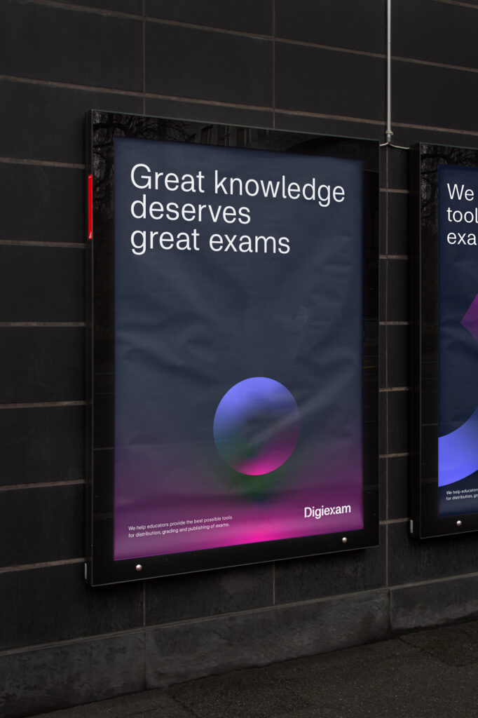
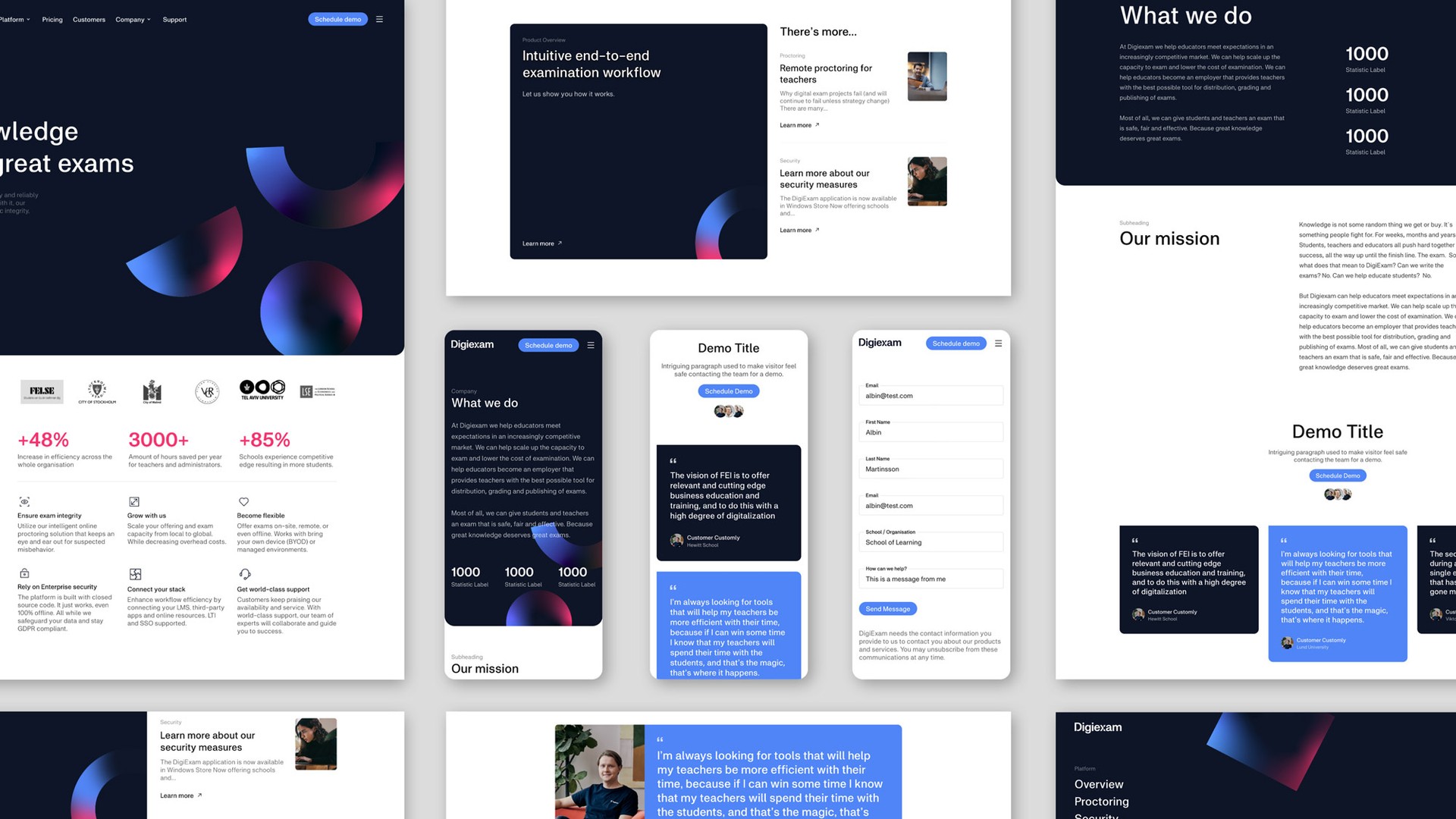
The rebrand started with a strategic reframe. Rather than positioning Digiexam as an examination platform with human-friendly features, we repositioned it as a brand that genuinely believes great knowledge deserves great exams. That shift — from product to purpose — changed everything that followed.
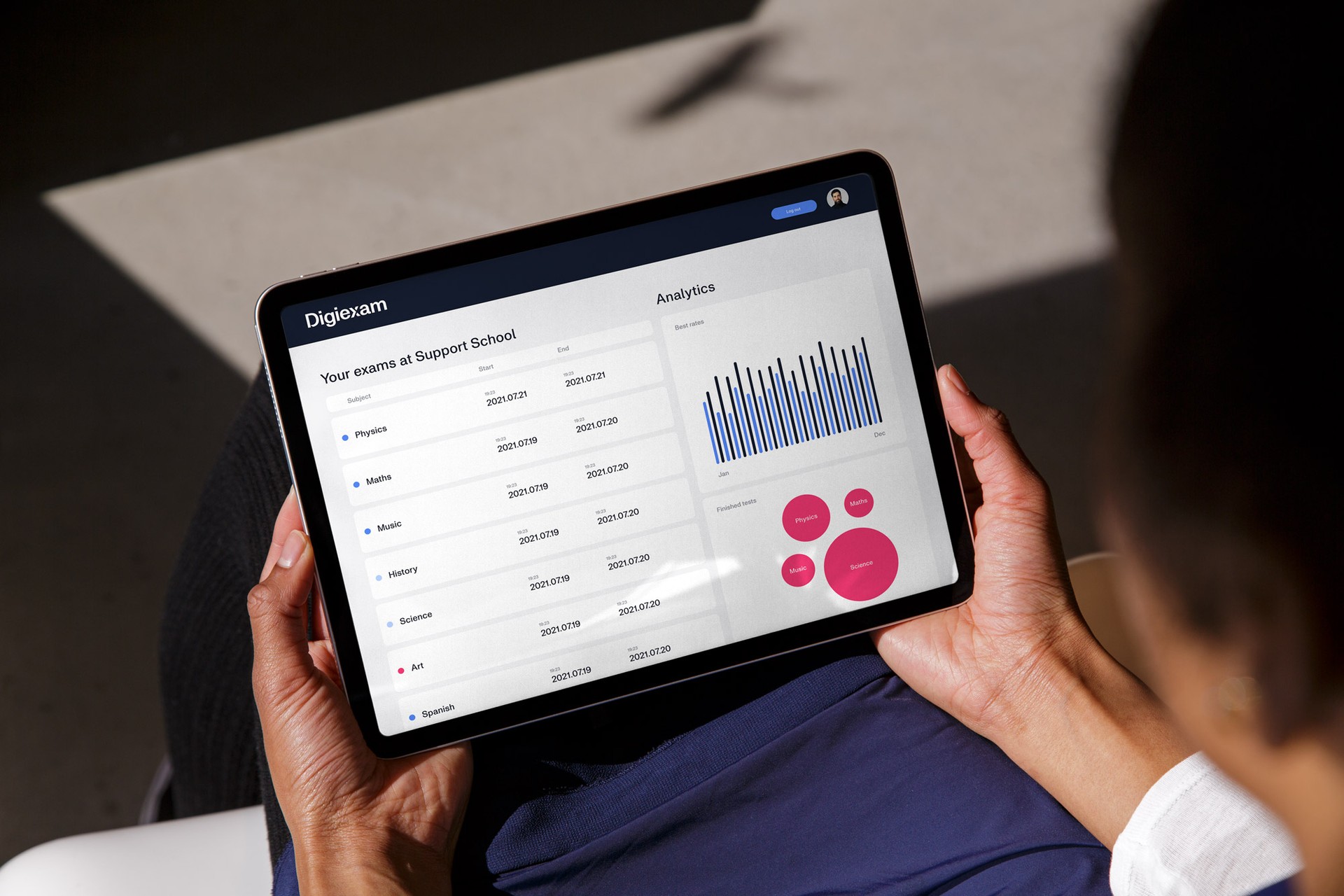
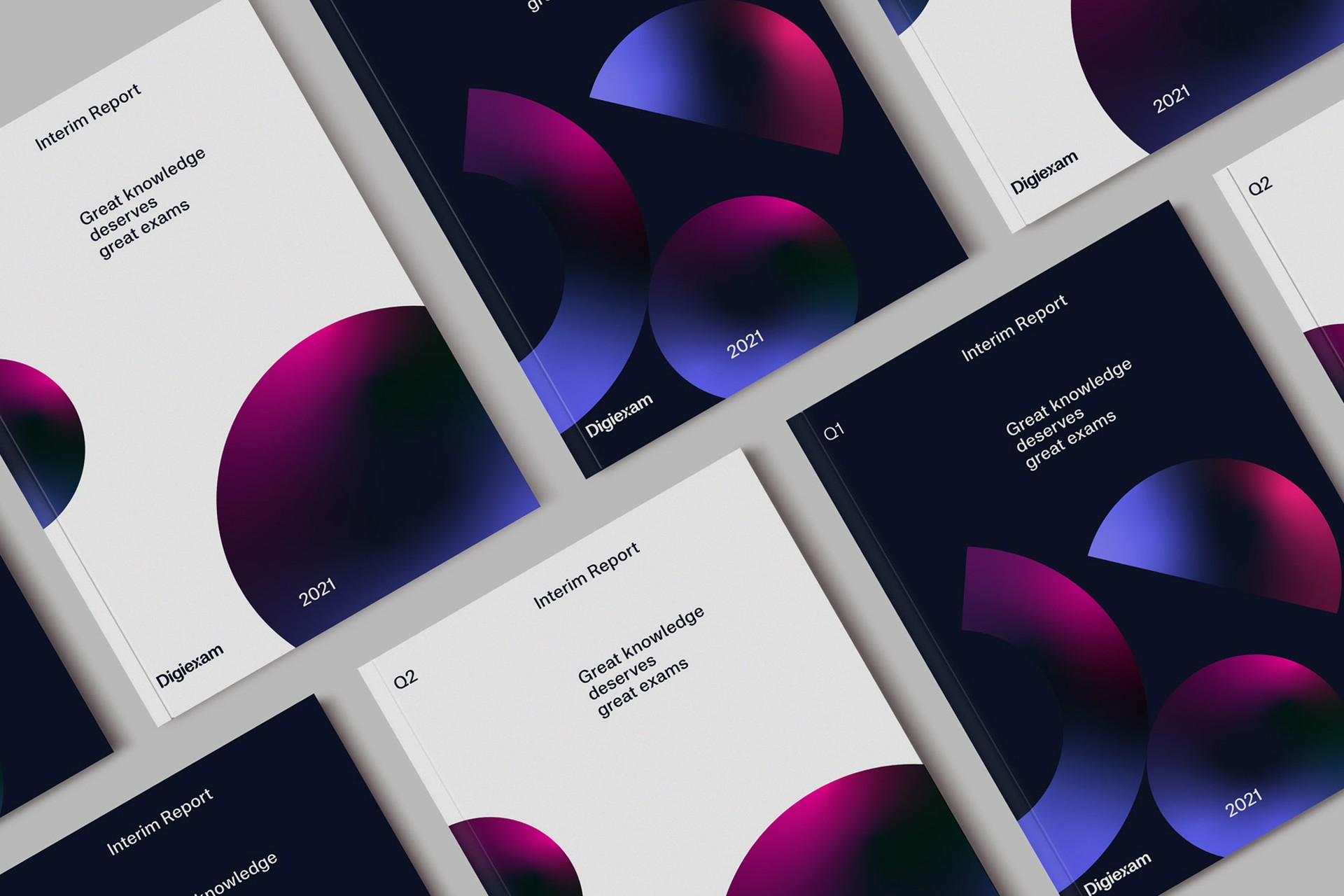
The visual identity was built around a central metaphor: knowledge as something accumulated, layered, and built over time. Illustrations represent the building blocks of knowledge gained through study and preparation — shapes stacked atop one another, symbolising the cumulative power of what students carry into an exam. Abstract enough to be versatile, meaningful enough to carry the brand's conviction.
The result is a visual language that transcends the typical software company aesthetic — warm and human where the category is cold and technical, purposeful where competitors are functional. Every element was designed to reinforce the same idea: that examinations are not just a process to be managed, but a moment that matters.


Result
A brand that positions Digiexam as a leader in EdTech — not just a platform
The rebrand gave Digiexam something no feature comparison or security credential could: a brand that stands for something. By centering the identity around knowledge rather than technology, Digiexam now occupies a distinct and defensible position in the EdTech market — one that resonates with educators who care about the learning experience, not just the logistics of delivery. A foundation built to support global expansion from a company that was already the most trusted name in Swedish digital assessment.