Challenge
Returns are a mess. Everyone knows it. Nobody had fixed it.
E-commerce returns are one of the most broken experiences in retail — for merchants and consumers alike. For merchants, the process is a drain: customer service tickets, manual warehouse entries, complex courier relationships, and refund workflows that take far too long. For consumers, it's fragmented and frustrating: separate registrations for each return, multiple parcels for multiple items, no clarity on what's happening or when.
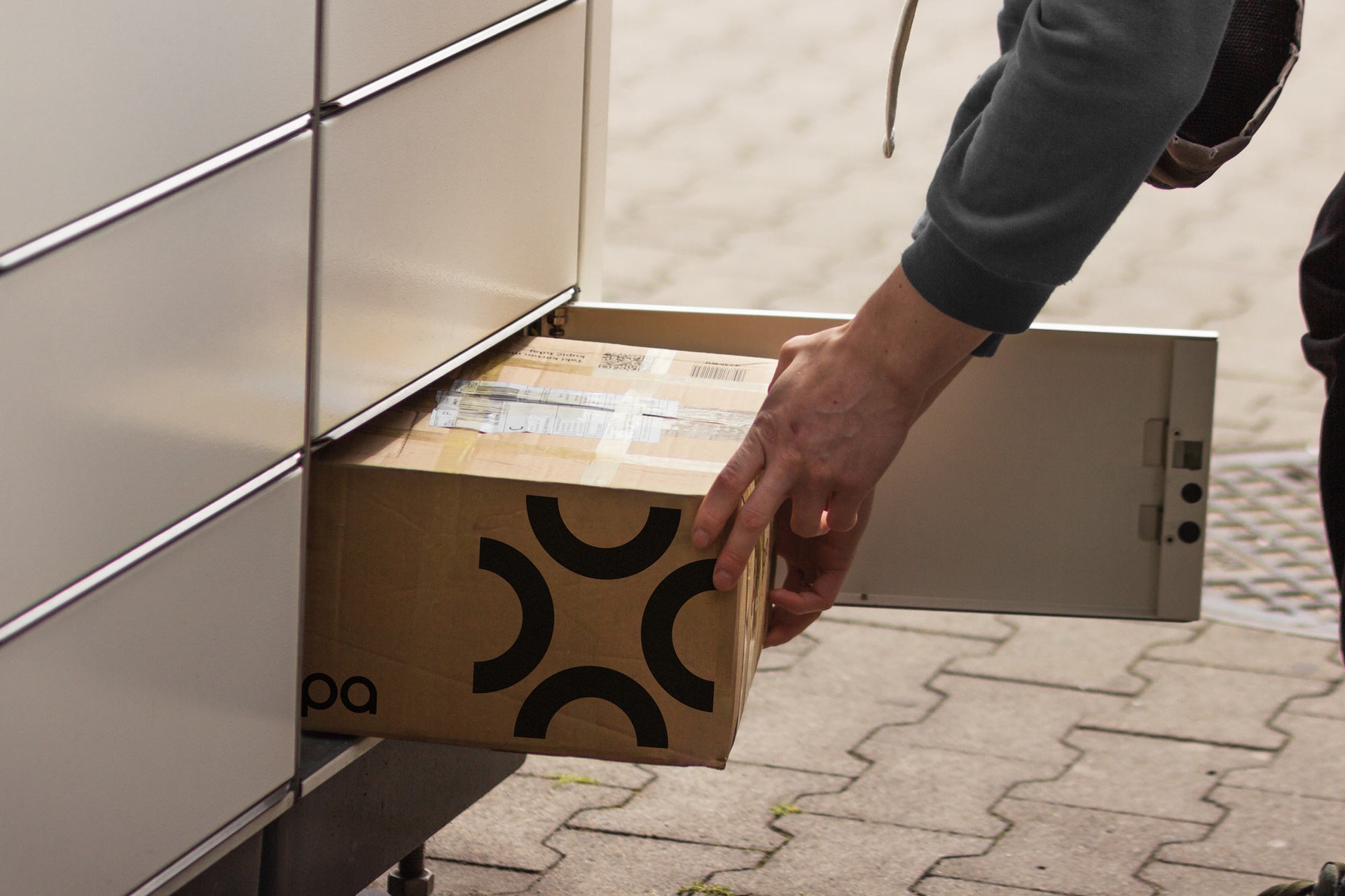
Droppa was founded by people who had lived this frustration as merchants. They knew exactly what was wrong — and they had built something to fix it. A platform that aggregates multiple returns into a single registration, a single parcel, and a single courier. Simpler for the consumer. More efficient for the merchant. Better for the planet.
The product was ready. The brand was not. Droppa needed an identity distinctive enough to stand apart from a logistics category that defaults to corporate blue, and relevant enough to connect with the fashion and apparel brands that form its core customer base. A visual world that communicated the same thing the product did: this is returns, done differently.
What we did
Brand strategy, identity, website, and app — built around a fusion concept
The engagement covered the full brand build: strategy, visual identity, messaging, website, and mobile app design. Strategy came first — because without a clear brand platform, no visual decision would have a foundation to stand on.
The brand strategy was built around three core values developed through market research and internal sessions. Commercial boost positioned Droppa as a platform that delivers measurable results for merchants — not just a better experience, but better business. Multi-returns standard captured Droppa's defining product innovation: one sign-in, one registration, one parcel, one carrier for all returns. And footprint reduction acknowledged the sustainability impact that fewer parcels and smarter logistics creates at scale.
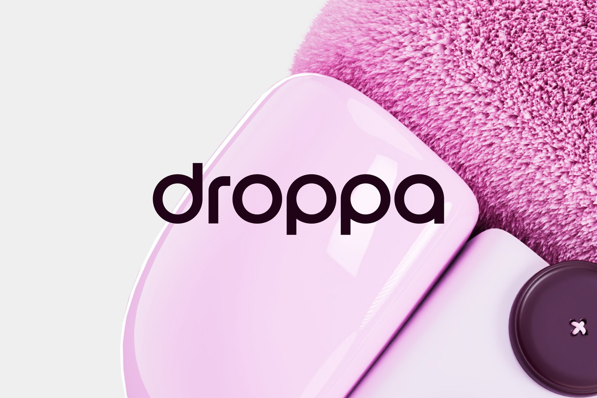
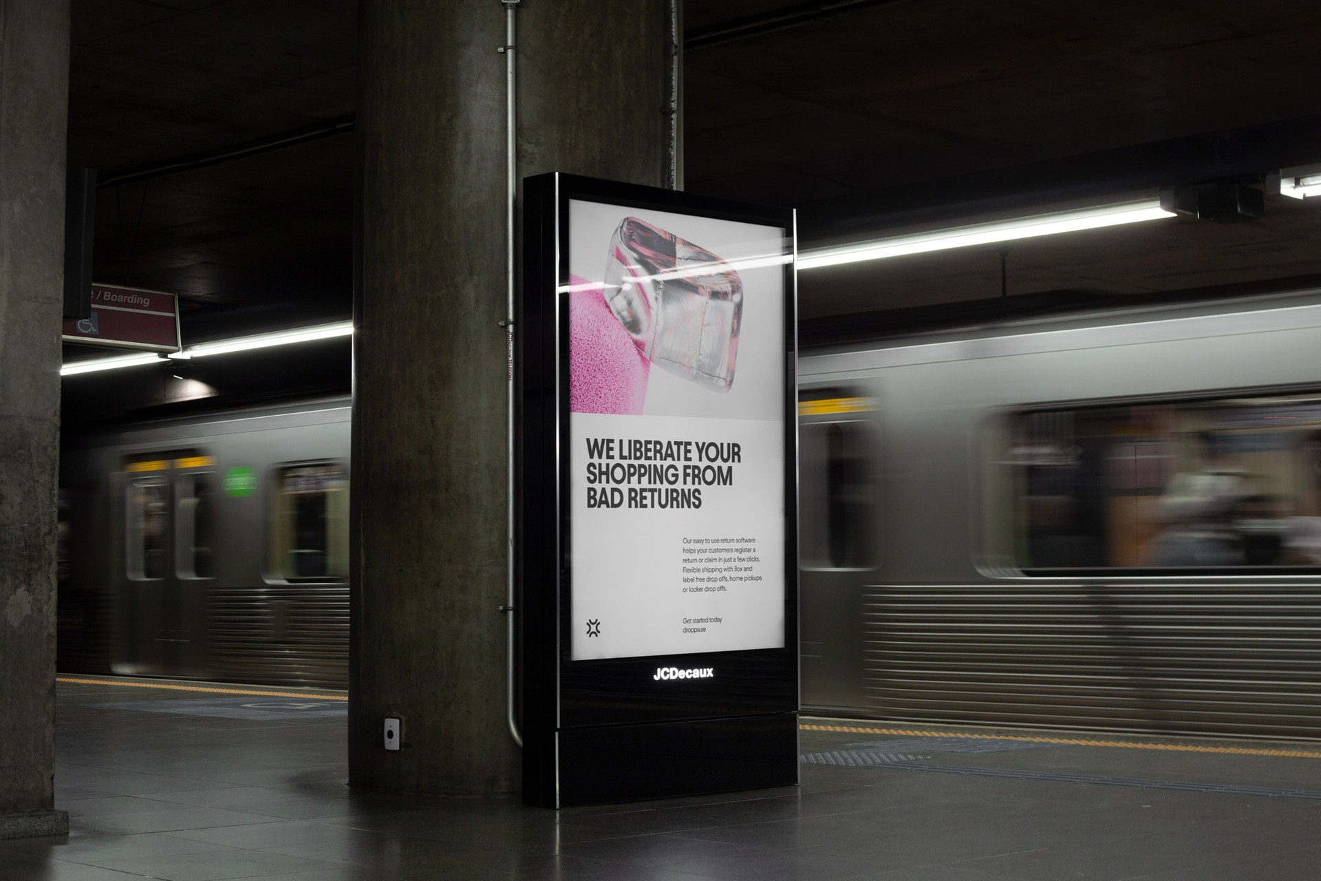
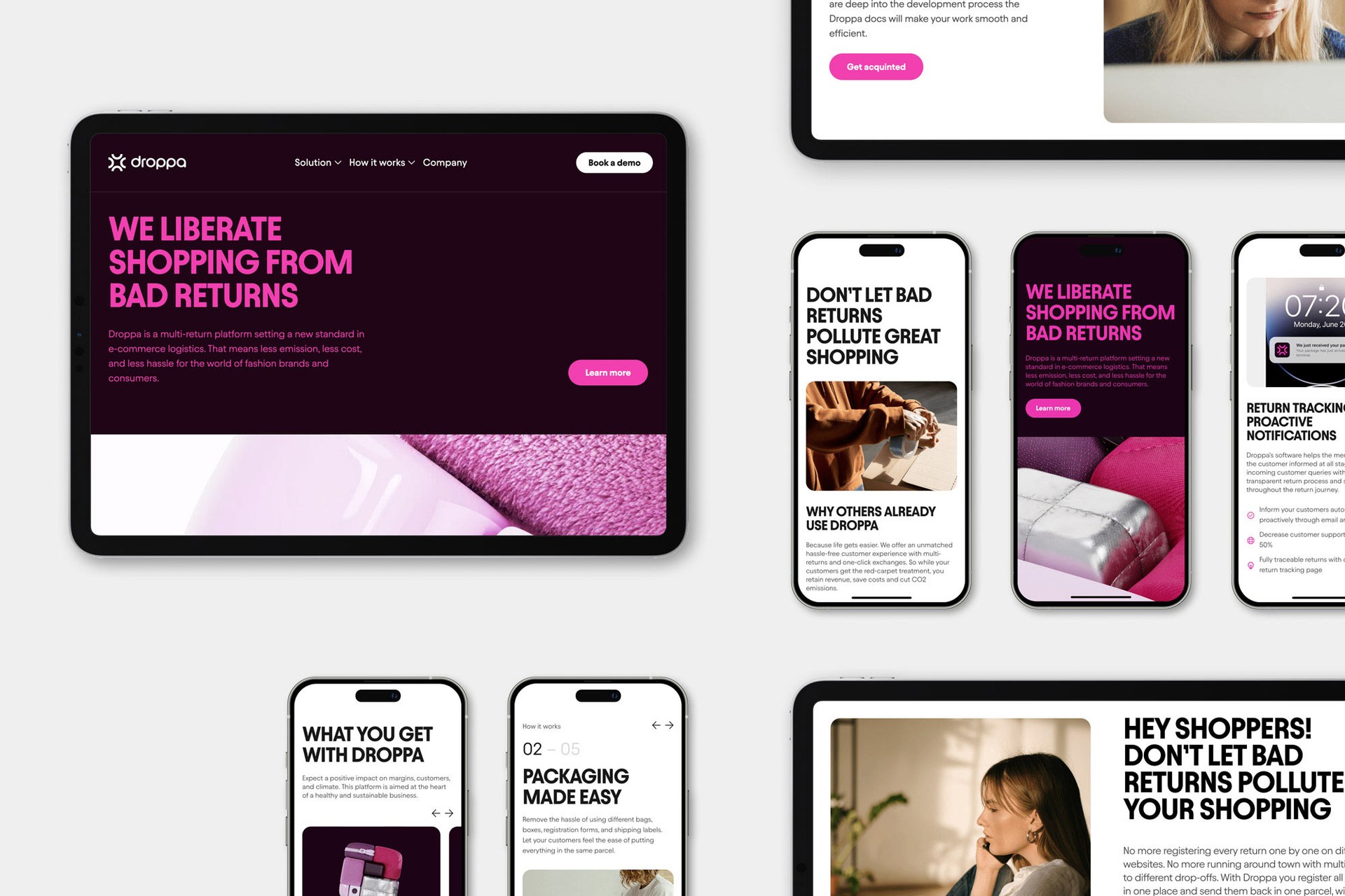
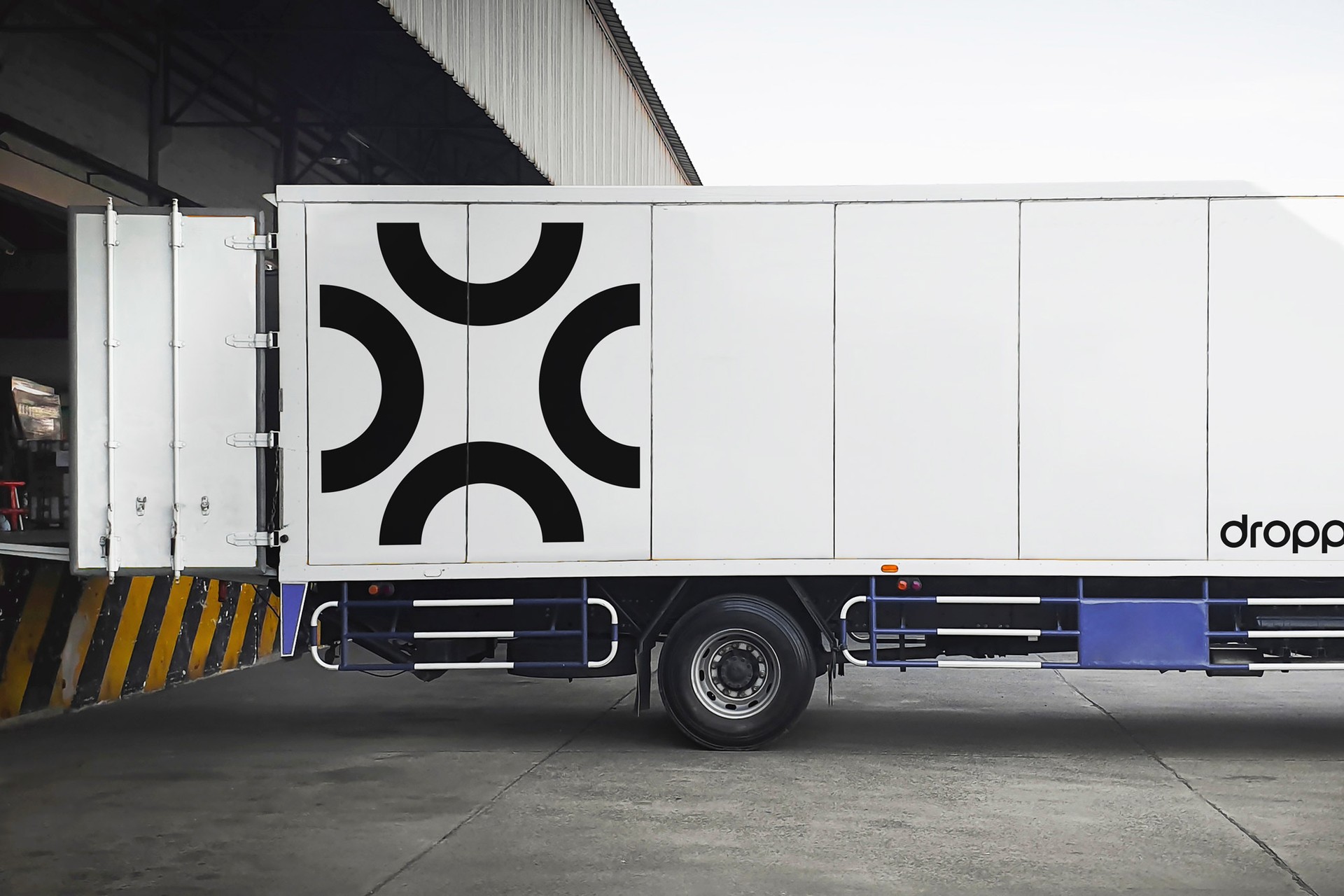
The visual identity was built around the concept of fusion — multiple objects becoming one. The same idea that defines the product. The logo integrates pieces of the wordmark's circles into a box to form a symbol that is literally the fusion of its parts. The color palette is vibrant and bold, deliberately distancing Droppa from conventional logistics aesthetics. Typography is distinctive and confident. 3D graphics incorporate textures drawn from textiles — a visual nod to the apparel industry that anchors so much of Droppa's customer base.
The website was built on Webflow: clean, subtly technical, but warmed by fashion-forward imagery that communicates the footprint reduction story with a sense of locality and care. The mobile app extended the same design language into a consumer-facing experience built for simplicity — making the multi-return flow feel as effortless as the product promises.
Result
A brand as distinctive as the problem it solves
Droppa launched with a complete brand system that looks nothing like the logistics category and everything like the fashion industry it serves. For a company built on the idea that returns don't have to be a mess, a brand that communicates clarity, boldness, and purpose is the right foundation — one built to grow with the platform as it expands across European markets.