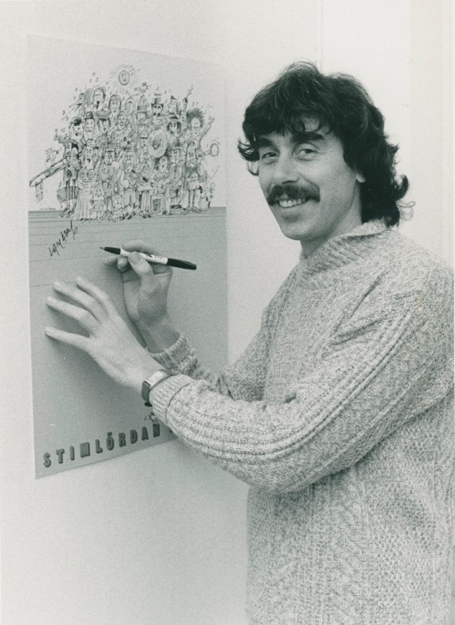
The logo wasn't just a logo. It was a gift.
GodEl's original logo was designed by Lasse Åberg — one of Sweden's most iconic artists, comedians, and filmmakers — who donated it entirely for free, as a gesture of belief in what GodEl was trying to do. For a company built on purpose over profit, a logo created in that spirit became more than a visual mark. It became part of the brand's identity and heritage.
After more than a decade of service, GodEl was ready for a refresh. The digital landscape had evolved. The places a logo needed to work — screens, apps, social media, digital marketing — demanded a level of versatility and clarity that the original wasn't built for. But modernising a logo with that kind of cultural weight required an approach far more careful than a standard rebrand.
The challenge was precise: evolve without erasing. Respect the legacy of Åberg's original while creating something that could carry GodEl forward into a new chapter.

Logo redesign — modernised, not replaced
The approach centered on preservation as much as evolution. Åberg's original creation was the foundation — the brief was never to start over, but to bring it forward.
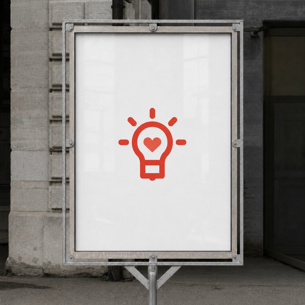
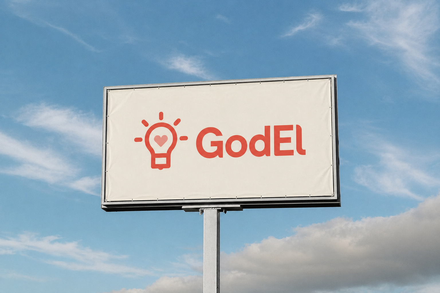
We refined the core elements of the original logo with a modern, minimalist touch. Subtle geometric shaping improved clarity and balance. Typography was streamlined to work cleanly across digital platforms and at any scale. The essence of what Åberg had created — its warmth, its humanity, its sense of purpose — remained intact. What changed was its precision and versatility.
The result is a logo that works everywhere GodEl needs to be: on a screen, a billboard, an app icon, a partner document. Clean enough for digital. Warm enough to carry the story.
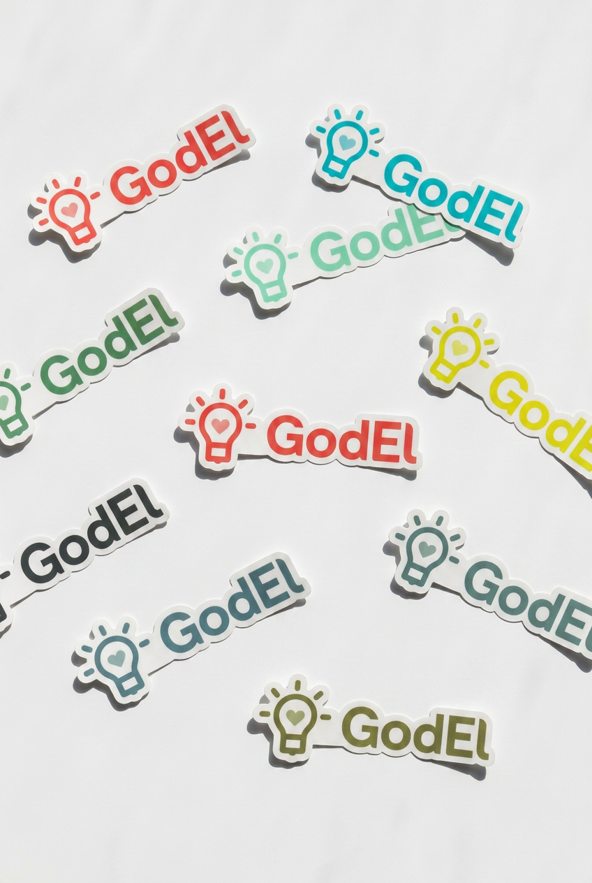
Color palette


A modernised identity that honors where it came from
GodEl's refreshed logo moves the brand into the present without leaving its past behind. The artistic spirit of Åberg's original gift is preserved — now expressed through a mark precise enough to grow with a company continuing to do genuinely good work in the world. For a brand built on the idea that business can be a force for good, the visual identity now reflects that conviction as clearly as the mission does.