Challenge
A new kind of investor — in a category where everyone looks the same
The Swedish private equity and investment landscape is crowded with firms making similar promises: active ownership, operational support, long-term partnership. The language has become interchangeable — which means the brand has to do the work that words no longer can.
Hasko Invest had built something genuinely distinct. A model that takes the long-term stability of an investment company and combines it with the operational depth and entrepreneurial hunger of an active owner — with no exit horizon, no pressure to sell, and no shortcuts. For the entrepreneurs Hasko targets — founders who have built something meaningful and want to hand it to an owner who will protect and grow it — this distinction matters enormously.
The challenge was making that distinction visible and credible through a brand. The audience is discerning and skeptical: founders who have been approached by countless investors and know how to read between the lines. A brand that looked like every other investment firm would signal exactly the wrong thing.
What we did
Brand strategy, visual identity, and website — built around a distinctive ownership philosophy
The engagement covered brand strategy, full visual identity, and website design and development. Strategy came first — because without a clear articulation of the Hasko model, no visual decision would have the right foundation.
The brand strategy distilled what makes Hasko genuinely different: selective partnerships, eternal ownership perspective, and cash-flow-focused growth. The positioning wasn't built around investment returns — it was built around what it means to be a committed, long-term partner to ambitious entrepreneurs. That framing shaped everything that followed.
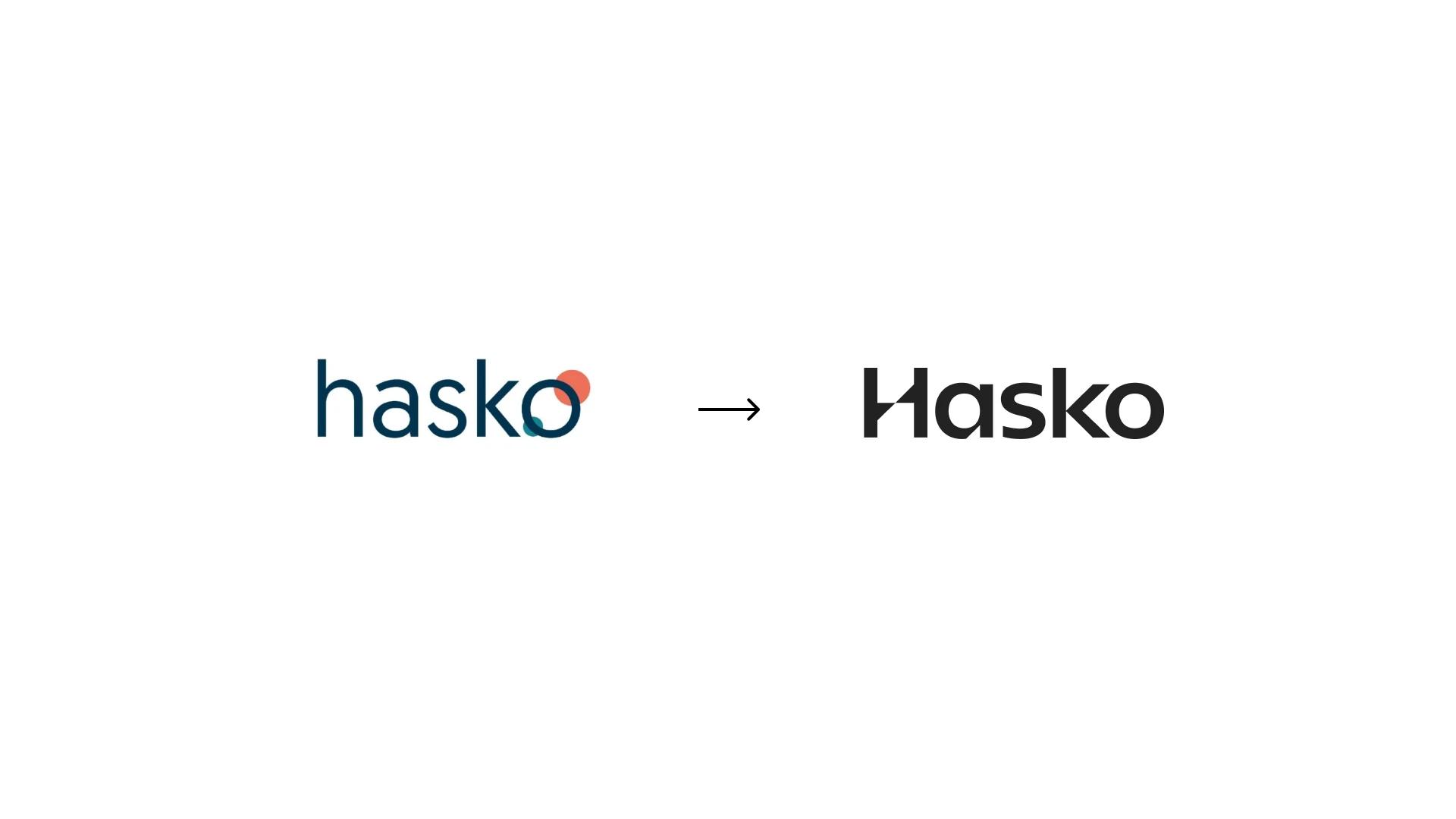
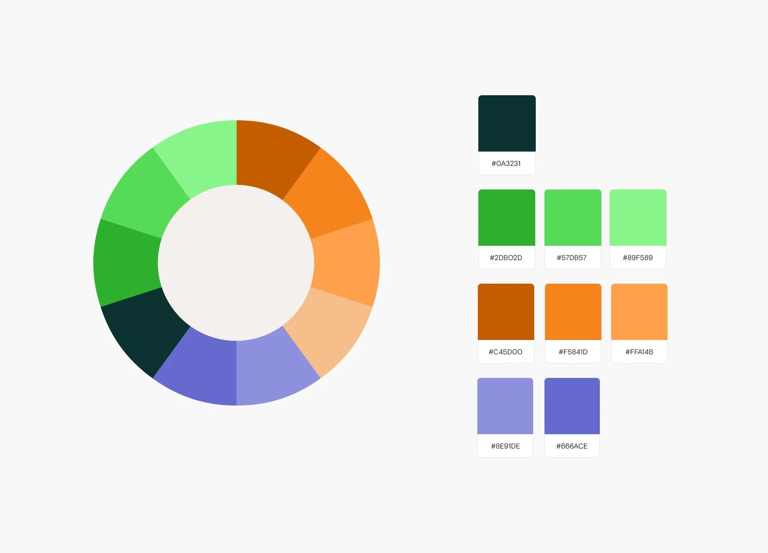
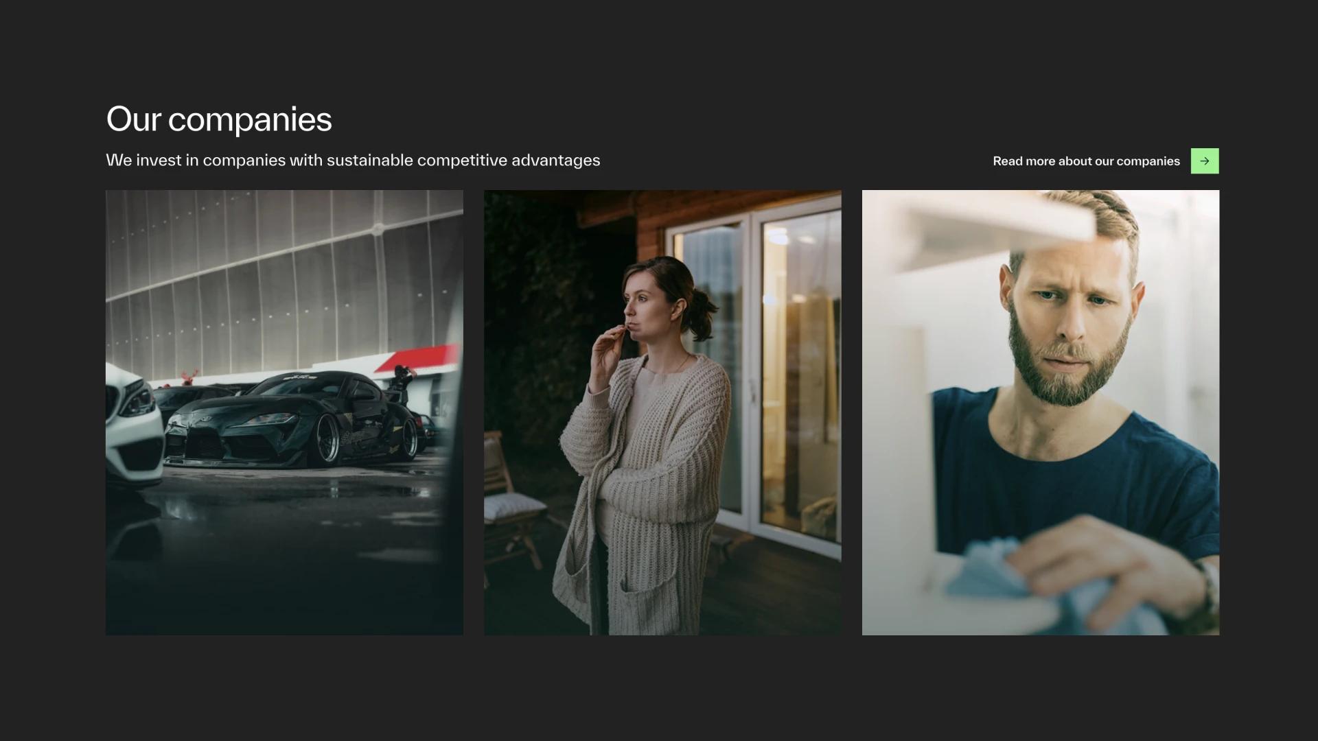
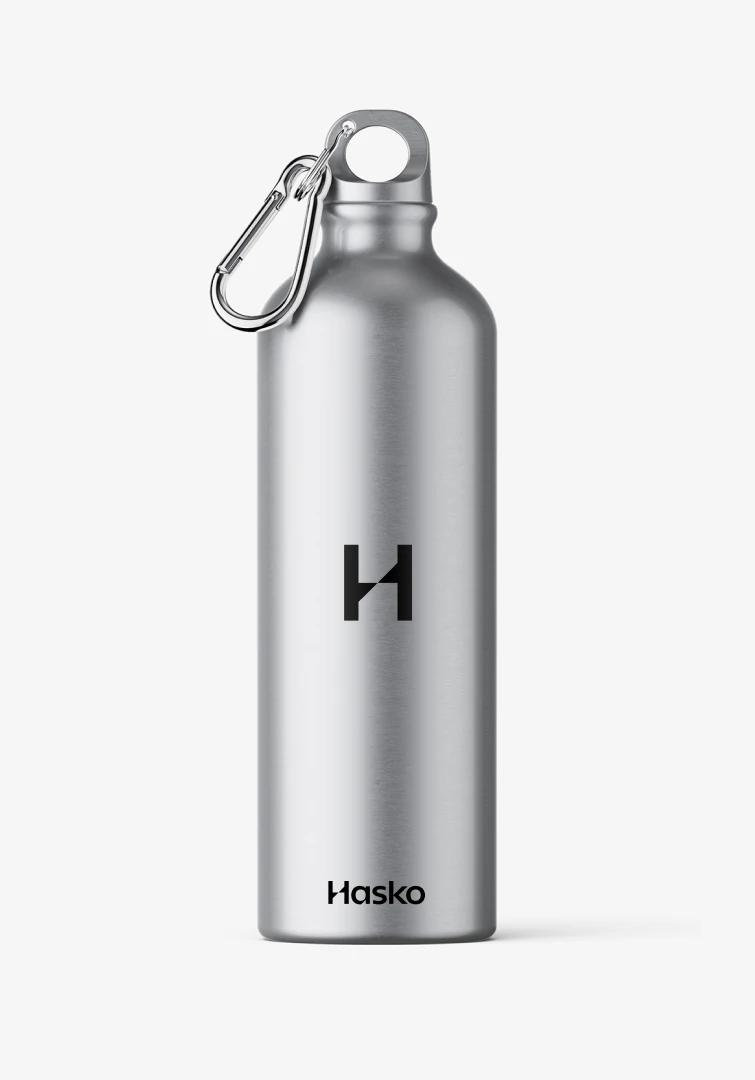
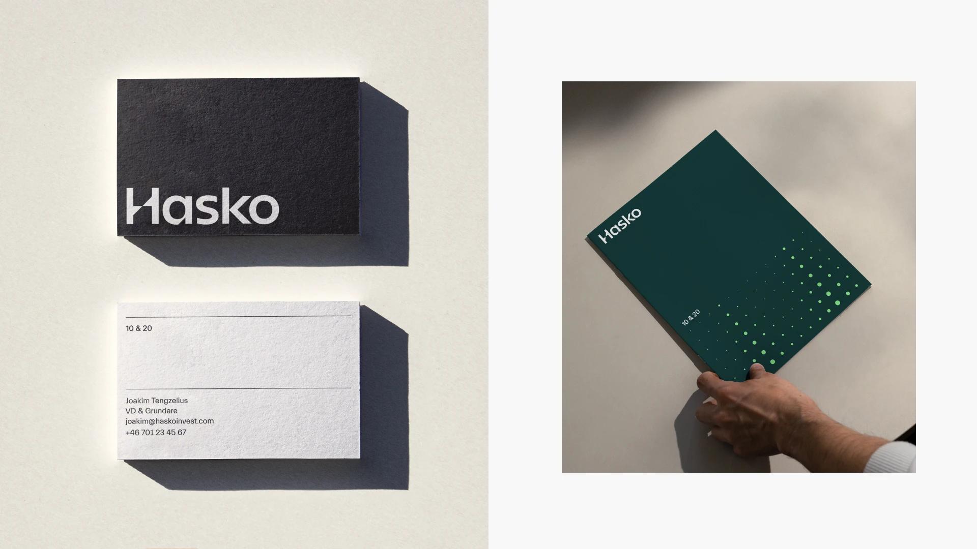
The visual identity was built to reflect Hasko's dual nature: competent and supportive, professional and human. A deep green and grey foundation establishes authority and calm — the palette of a company that thinks in decades, not quarters. Bright green accents introduce energy and growth without undermining the sense of stability. The result is a brand that feels serious without feeling cold.
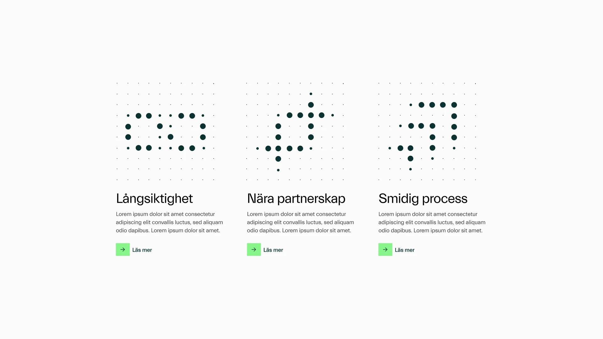
Brand patterns were developed directly from Hasko's core philosophy — the careful selection of partners, the data-driven approach, the commitment to long-term growth — giving the identity a layer of meaning that rewards attention. Illustrations and infographics adopt expressive colour against calm backgrounds, ensuring complex information is communicated clearly and purposefully.
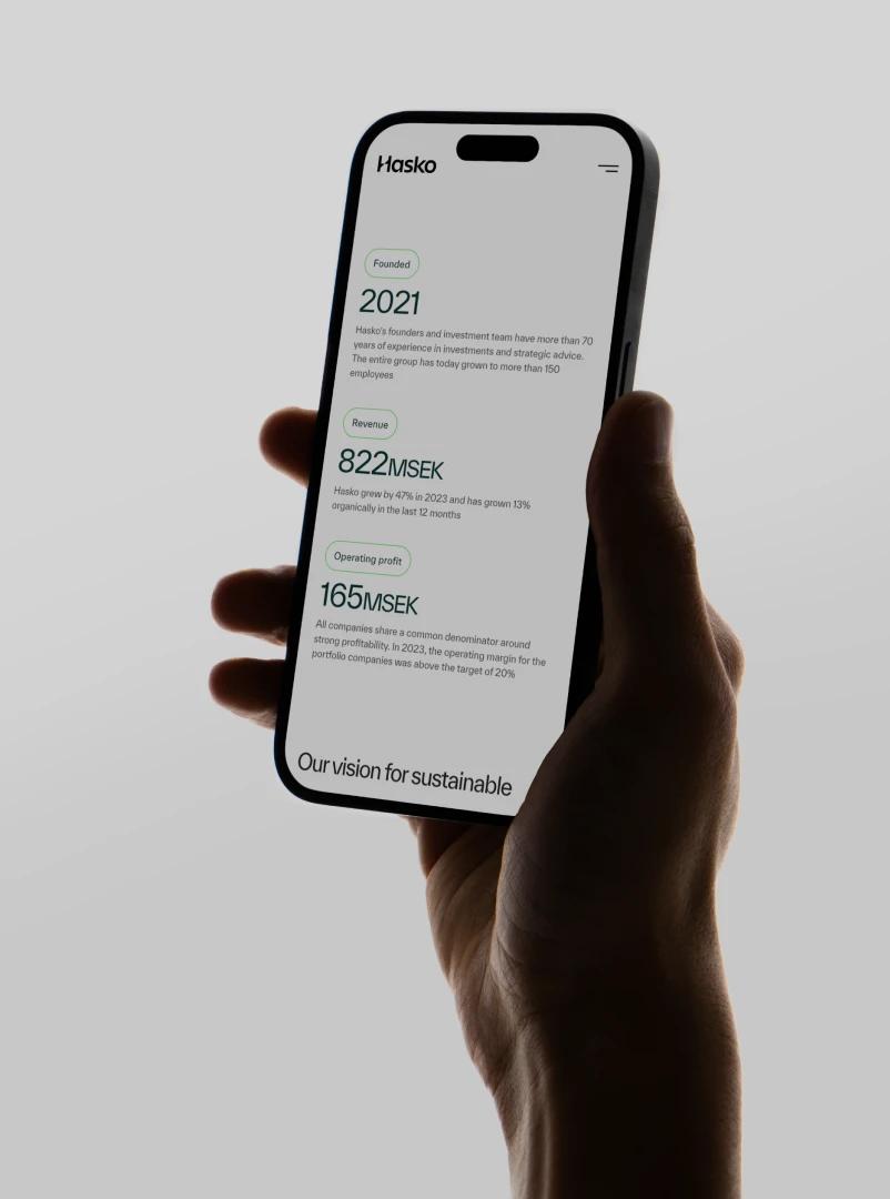
The website extended the identity into a digital experience built around transparency and depth. Charts, infographics, and structured content communicate Hasko's operational expertise and strategic approach — positioning them not just as investors, but as the knowledgeable partners their portfolio companies actually need.


Result
A brand that communicates a different kind of ownership
Hasko Invest now has a brand that does what the model promises: stands apart, speaks directly, and earns trust with an audience that has seen everything. The refreshed identity has also created a unified foundation internally — reinforcing the knowledge-sharing and affiliation advantages that come with being part of the Hasko group. For a company whose entire proposition rests on long-term relationships, a brand built to last is exactly right.