A beloved product in a crowded space — without a unified brand to match
Napper had already done the hardest thing: built a product that genuinely works. Over 100,000 families trusted it. The reviews were exceptional. The science behind it was sound. But the brand and visual system hadn't kept pace with the product's ambition or its growing audience.
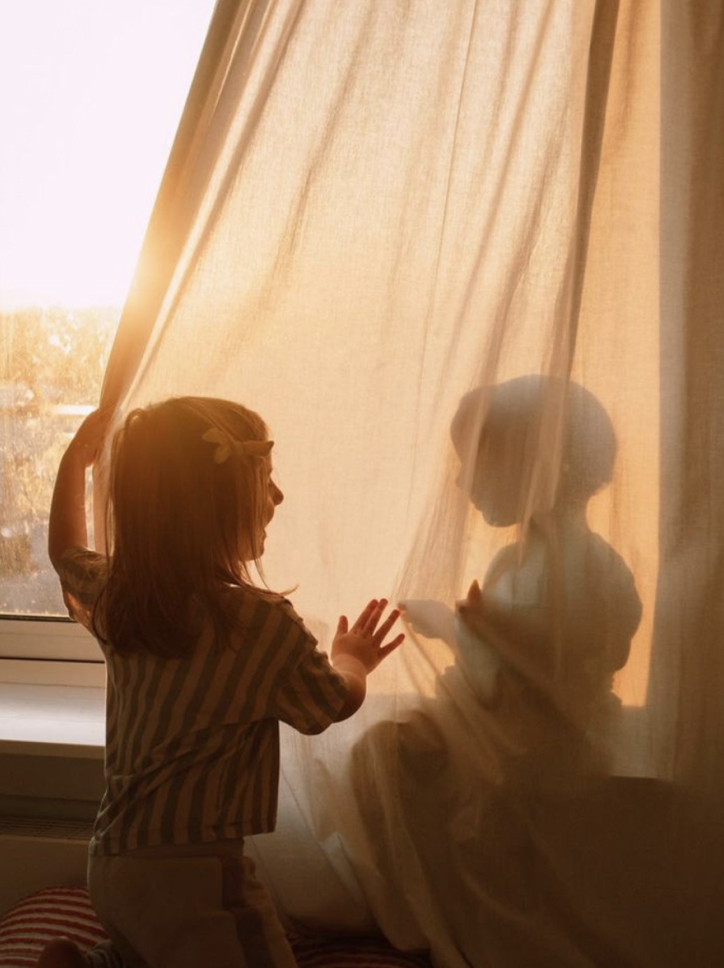
The parenting app space is saturated. Standing out requires more than good functionality — it requires a coherent world that parents want to spend time in. Especially at 3am, one-handed, in a dimly lit room, trying not to wake a finally sleeping baby.
The challenge was building a unified visual system that could do two things simultaneously: communicate the data-driven precision that makes Napper credible, and deliver the emotional warmth that makes exhausted parents feel supported rather than overwhelmed. Those two registers — clinical and comforting — had to coexist across every touchpoint, from a marketing billboard to an Apple Watch glance.

Big sleep for tiny dreamers
Brand identity, app UI, widget, and smartwatch — one coherent world
The engagement covered the full product surface: brand identity, app UI refresh across phone and tablet, widget design, and Apple Watch experience. Every platform treated as part of the same system, not a separate brief.
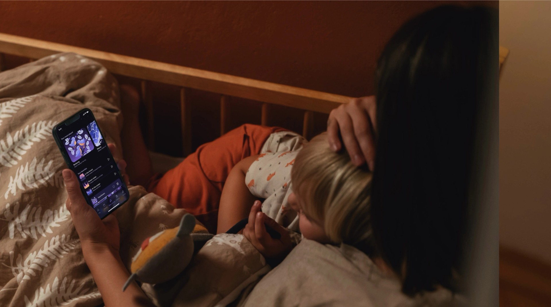
The strategic foundation was the Napper Brand Scale — a framework that maps the full spectrum of visual expression across contexts. Marketing material leans into warm, light colors and emotional imagery. The app lives in dark mode with illustrated elements, built for parents navigating screens in dimly lit rooms. Everything in between draws from both registers depending on context.
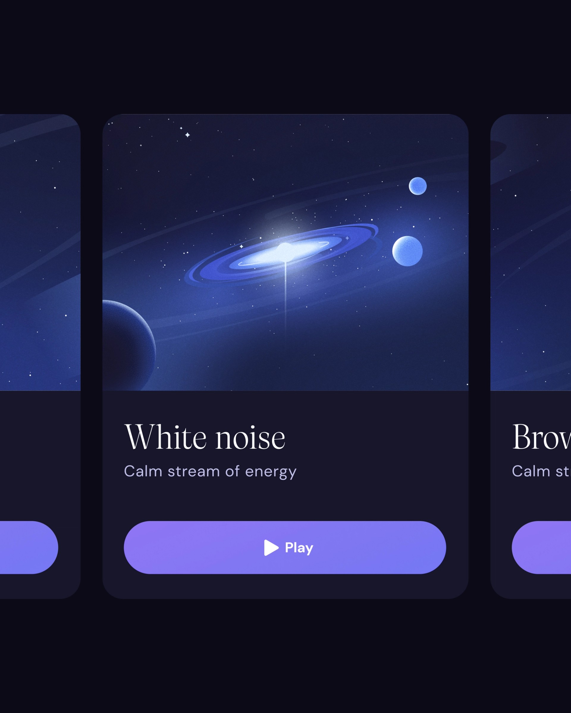
At the heart of the app lives Napperland — an illustrated world built in layers, each with its own color logic. Foreground elements brighter and more saturated, backgrounds darker and more muted, the sky shifting between blues, pinks, and purples to set the mood of each scene. The system gives Napper's team a clear framework for creating new compositions that always feel part of the same world.
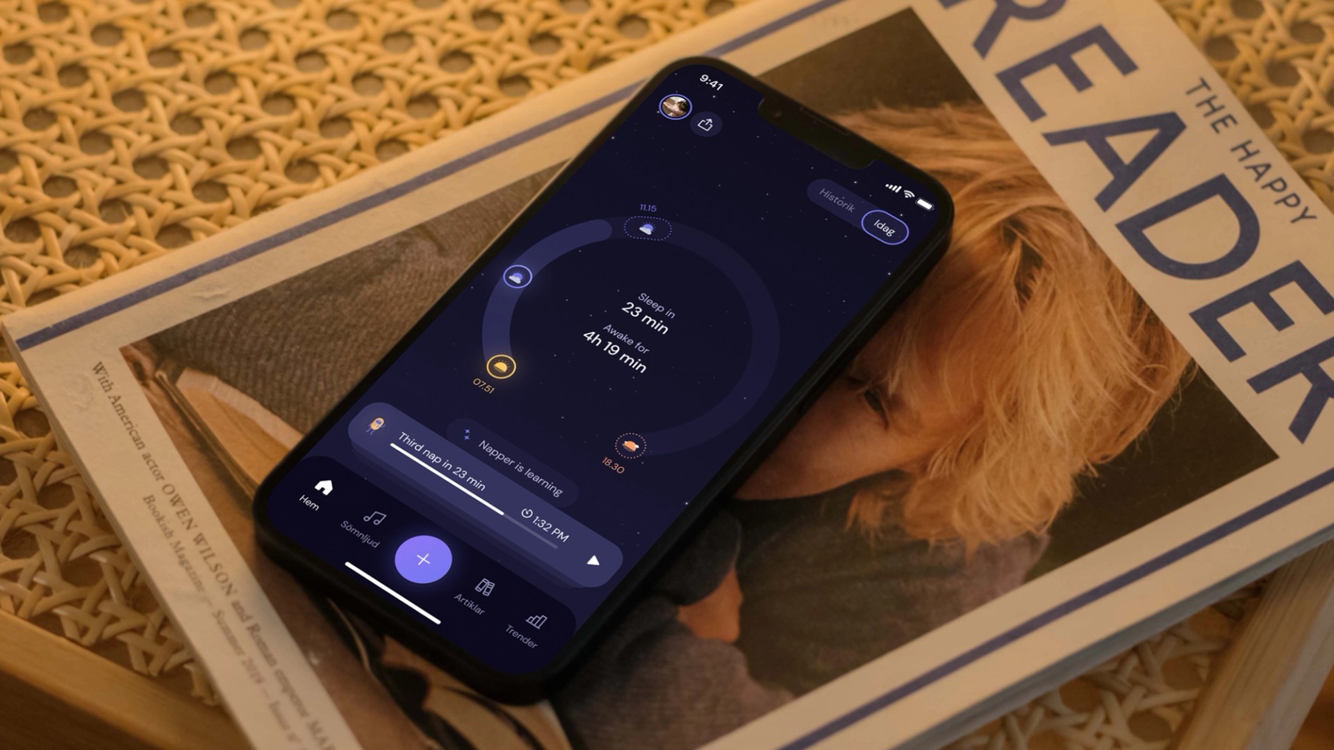
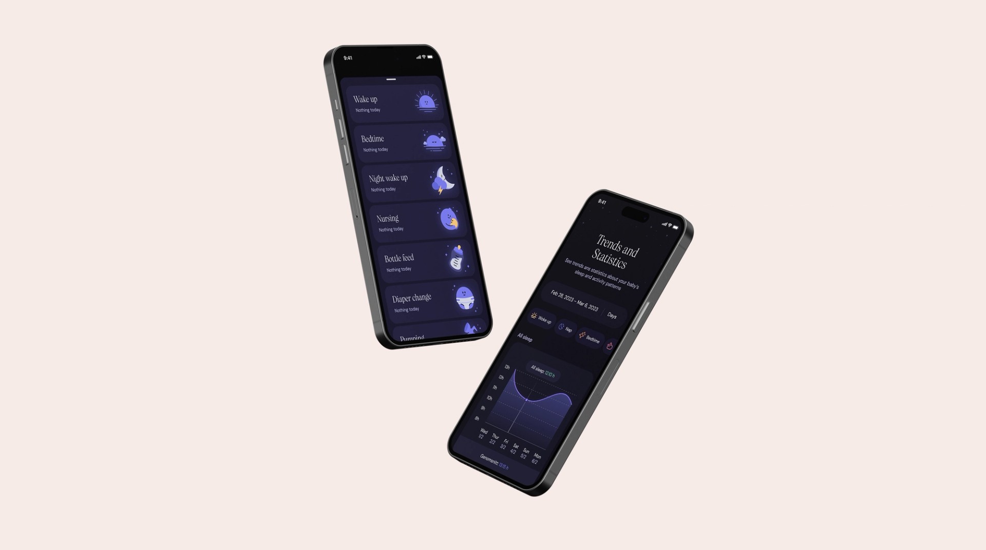
The app UI was designed for the specific physical reality of its users: one-handed, sleep-deprived, operating in low light. Large tap targets, high contrast in dark mode, and an information hierarchy that always surfaces the single most useful next action — without anxiety, without overwhelm.
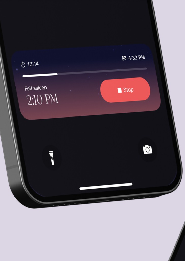
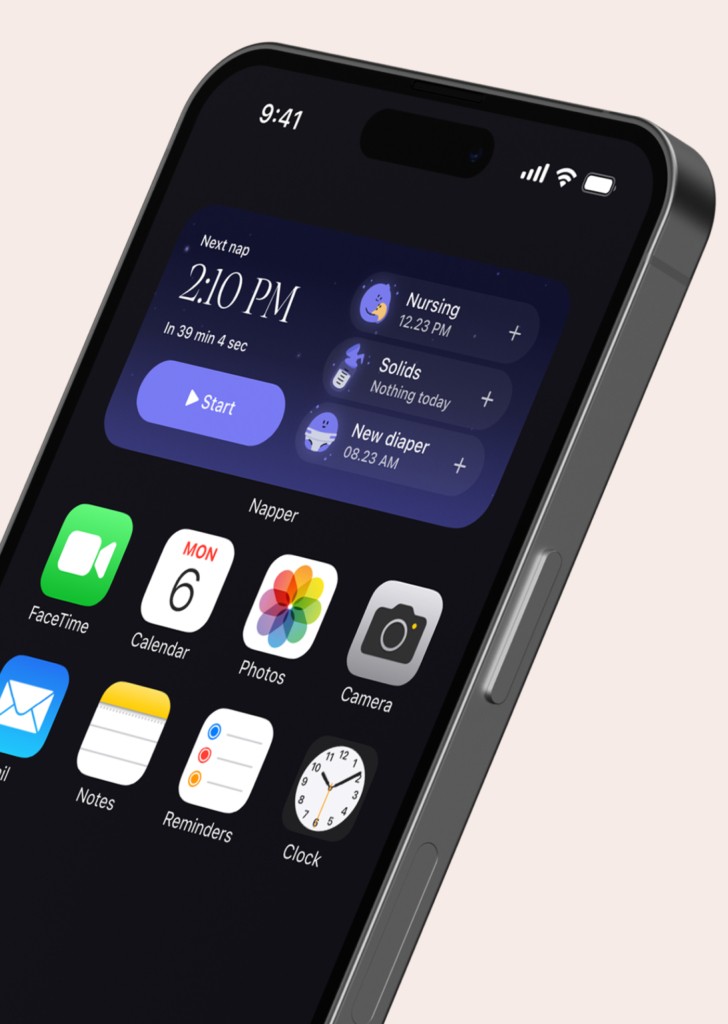
The widget and smartwatch experiences strip everything back to essentials: the next nap window, a quick-start timer, the current sleep prediction. Useful in a glance. Gone before the baby stirs.
A unified brand world that makes sleep science feel like a bedtime story
Napper now has a visual system coherent enough to flex from App Store assets to a smartwatch face without ever losing its soul. The brand feels like what the product is: a warm, intelligent companion for one of parenthood's most exhausting seasons — designed with the same care and precision it asks parents to trust.