The wellness space doesn't have a product problem. It has a trust problem.
The market for workplace health platforms is crowded, noisy, and full of products making similar claims. Personalized. Data-driven. Empowering. The language has become interchangeable — which means the brand has to do the work that words no longer can.
Pheno had something worth believing in. A platform that combines blood biomarkers, behavioral data, and AI into genuinely personalized health guidance — built for professionals and the companies that employ them. The science was serious. The ambition was clear.
The challenge was building a brand that could hold both things at once: the clinical sophistication of a data-driven health platform, and the warmth required to make people actually engage with their own health. In wellness, cold doesn't convert. But soft doesn't earn trust either. The brand had to live in the space between.
And it had to do it from scratch — no existing identity, no established visual language, no template to build from.

Strategy, brand, product, and web — as one brief
Most Studios came in as a full partner at founding stage, taking on the entire brand and digital build. Strategy, visual identity, product design, website, and social content — treated not as separate workstreams but as a single, coordinated system.
The brand strategy established what Pheno stands for and who it speaks to: wellness-conscious professionals and the forward-thinking companies willing to invest in them. From that foundation, every visual and verbal decision followed a consistent logic — empowerment, personalization, intelligence.
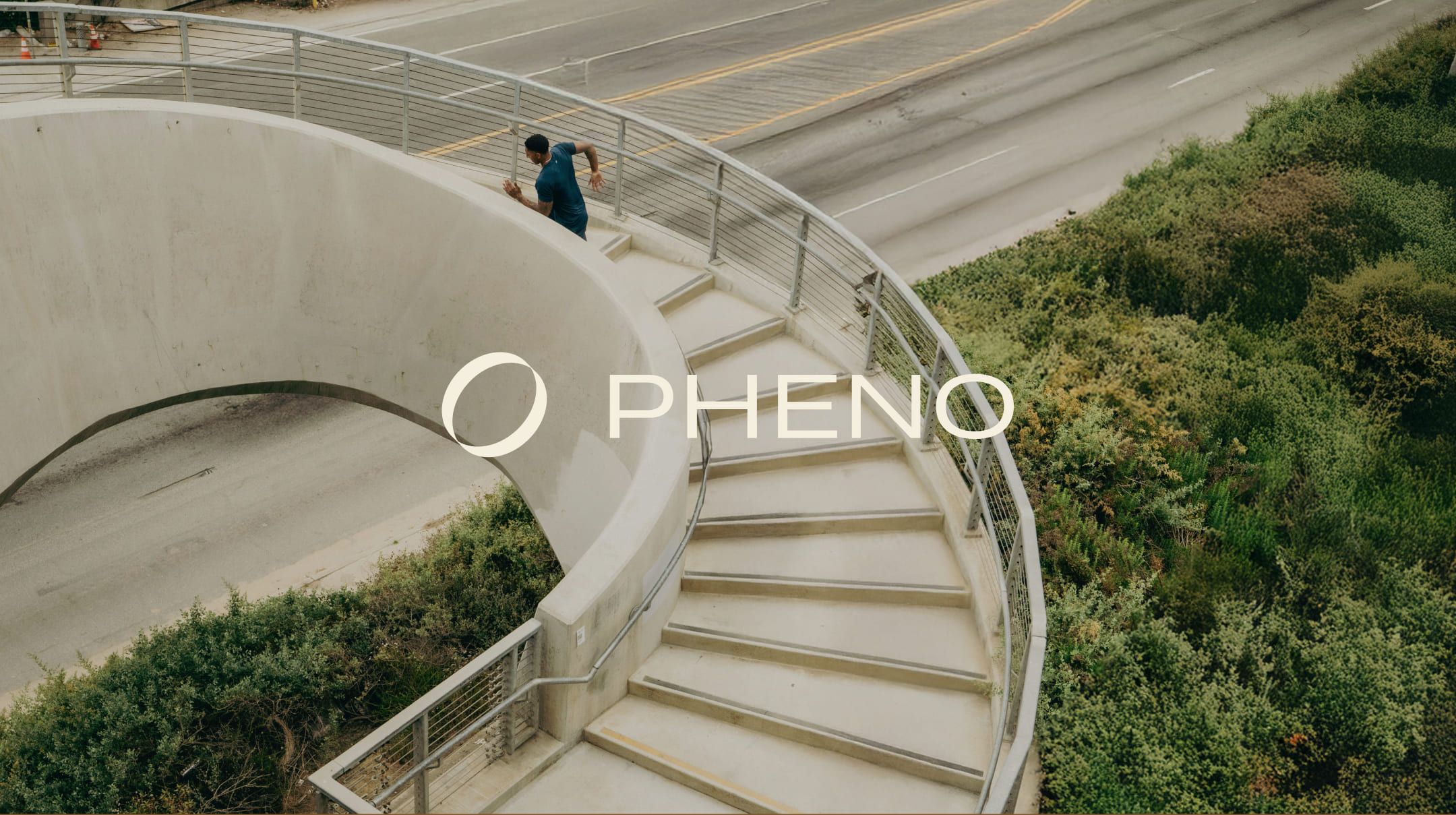
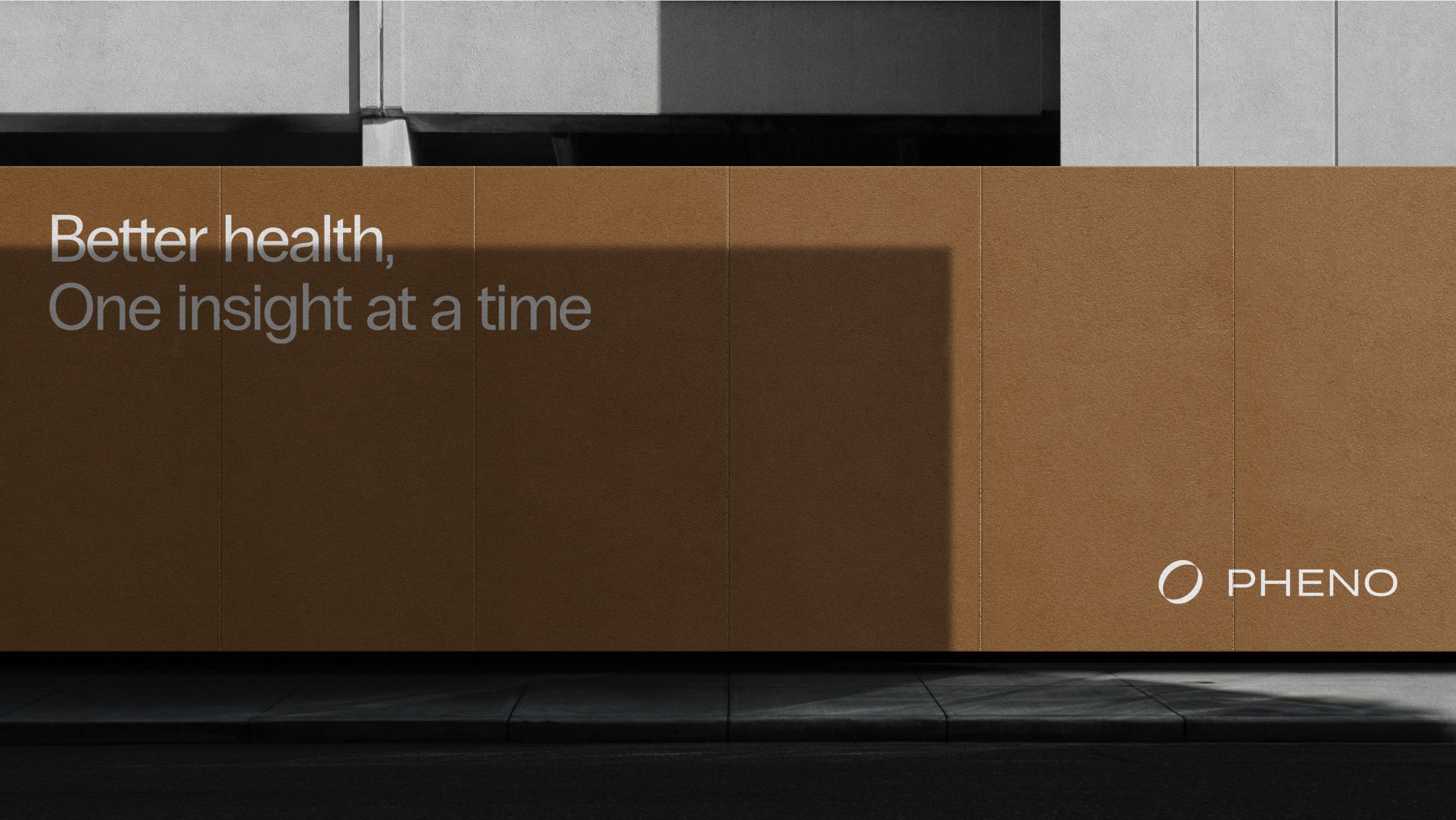
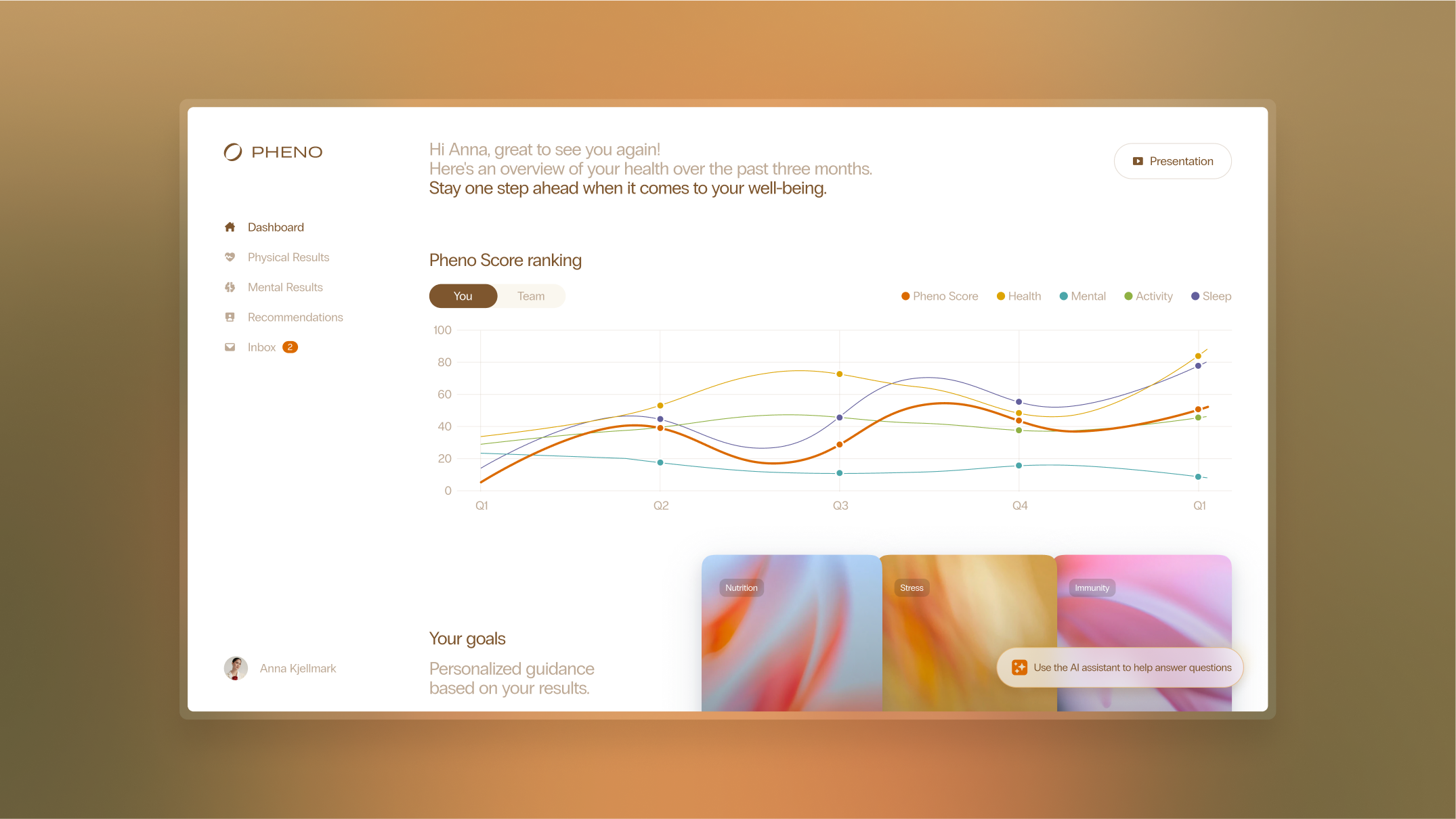
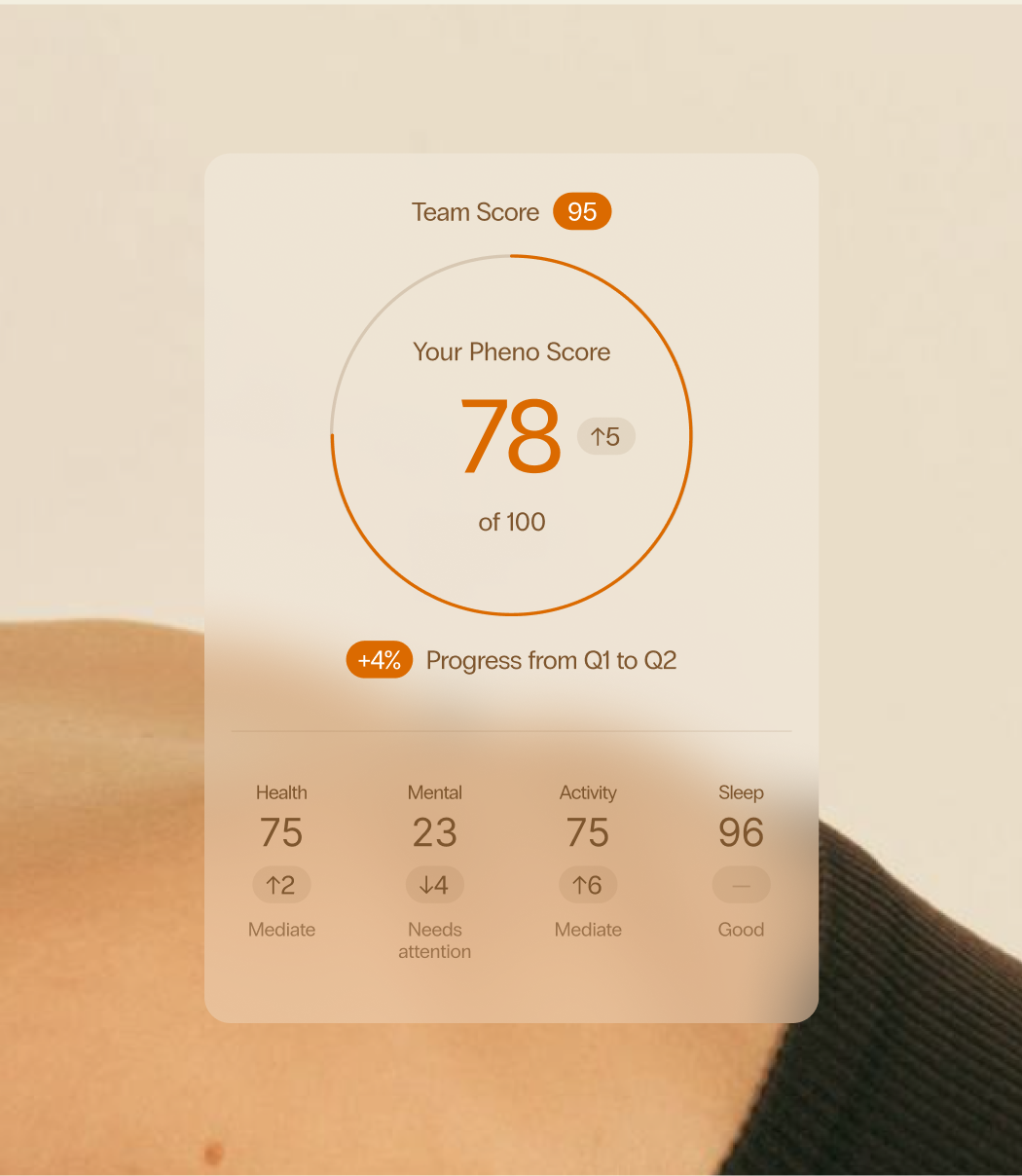
The visual identity was built around the circle — a symbol that recurs across the logo, UI, and motion design, representing balance, connection, and the full spectrum of health. A dual-register color system separates the warm, light marketing expression from the dark, rich in-app experience — giving the brand flexibility across contexts without ever losing coherence.
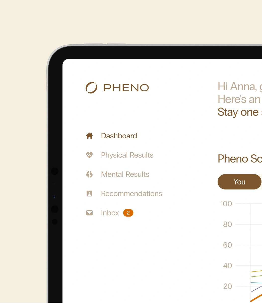
The product design extended that identity into every screen: onboarding, insights, health scores, daily guidance. The experience was built to guide users gently through their wellness journey — clinical enough to be credible, human enough to be used.
The website was built for a different audience: HR leaders, executives, and decision-makers evaluating whether Pheno belongs in their organization. Clear, elegant, and conversion-focused — it makes the platform's value feel concrete without losing the warmth that makes it distinctive.
“Most Studios have shown incredible sensitivity to both the big picture and the details. They helped us find the language, the form, and the feeling that truly carry our entire idea.”
— Alan Rahimi, Founder, Pheno
A brand that makes complex health feel human
Pheno launched with a complete brand system, a product experience, and a digital presence that could hold its own in one of the most competitive spaces in health technology. A company that didn't exist as a brand 6 months prior now has a visual and verbal identity coherent enough to scale — across markets, platforms, and the continued evolution of the product itself.
“Designing for Pheno was about creating a health experience people actually want to engage with. It had to feel warm and human without losing its intelligence and ambition.”
— Claudia Merckling, Senior Designer, Most Studios