Excavating the core
Most Studios worked closely with TIP's key stakeholders to excavate what was already there: the values, the expertise, and the market position built over five decades. Through discovery, stakeholder alignment, and iterative development across both strategy and design, we built a foundation that reflected TIP's full ambition and set a clear direction for how the brand should look, sound, and show up.
A brand that knows where it's going
The strategic work crystallised TIP's identity around four core positions: a simplifier of complexity, a true full-service partner, a provider of financial clarity, and a sustainability accelerator helping clients stay ahead of future demands. Together these pillars gave TIP a clear, confident voice and a messaging framework that works across every audience.
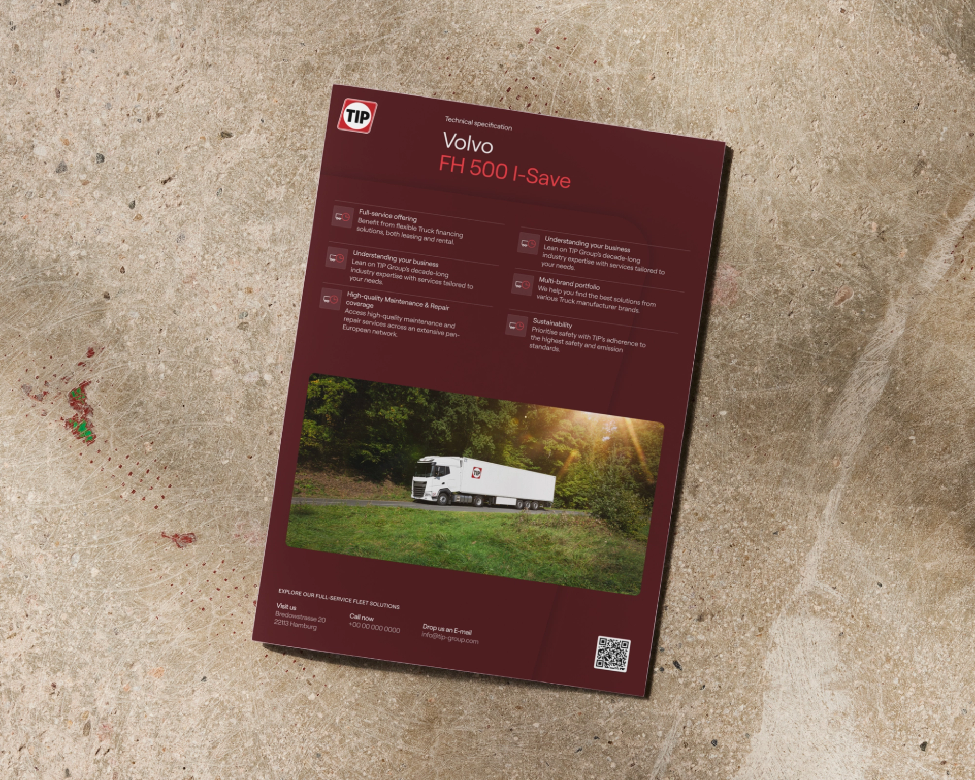
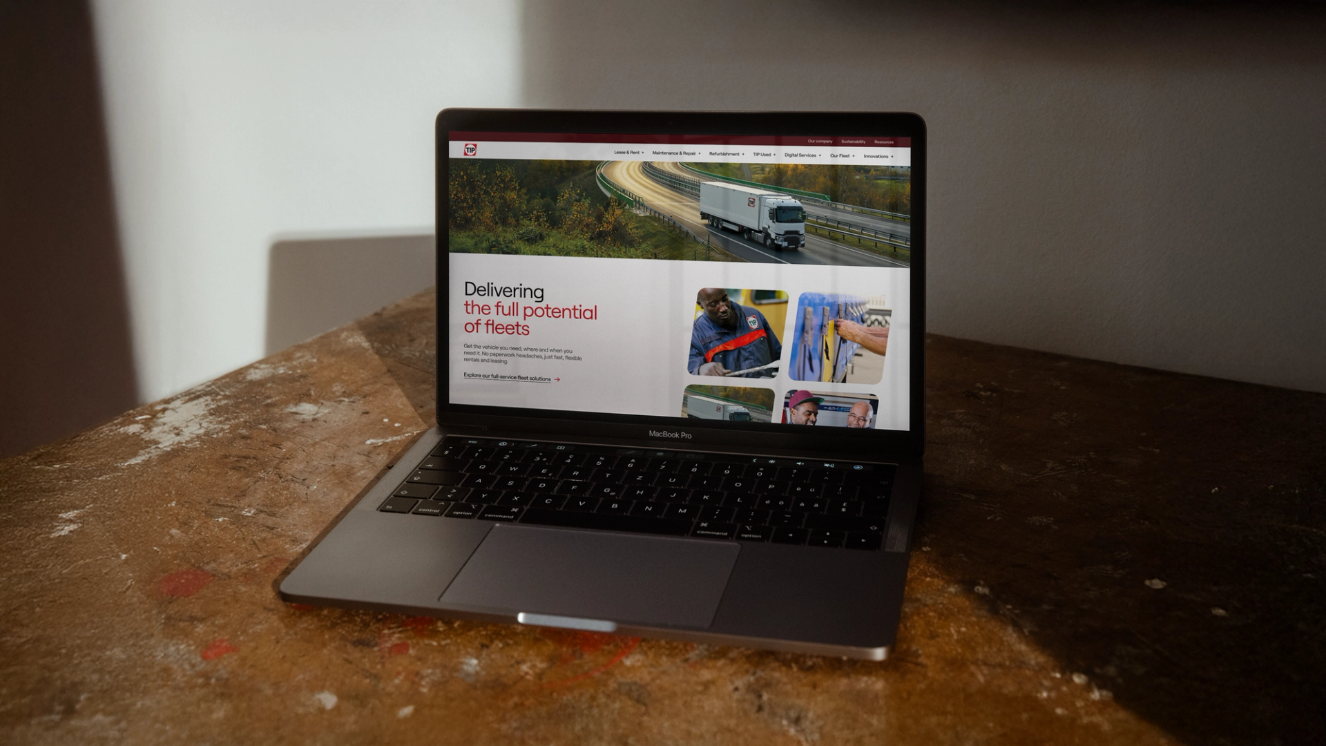
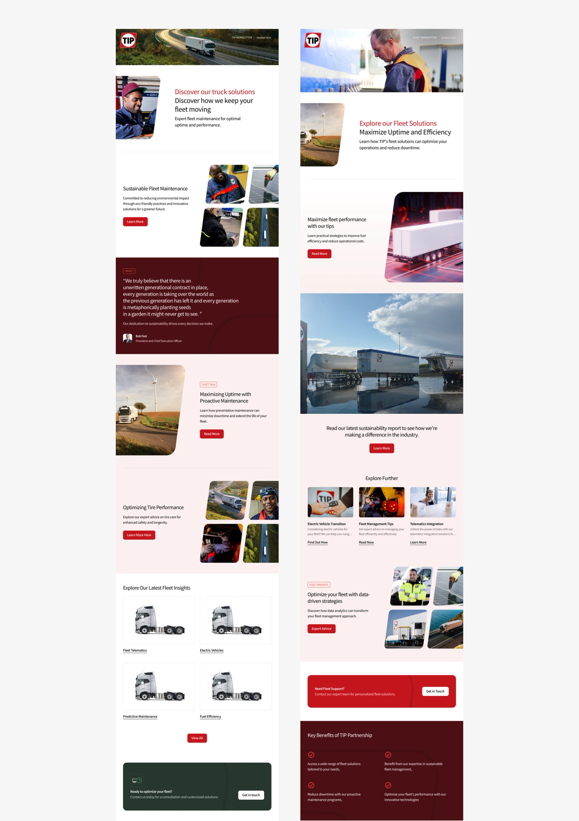
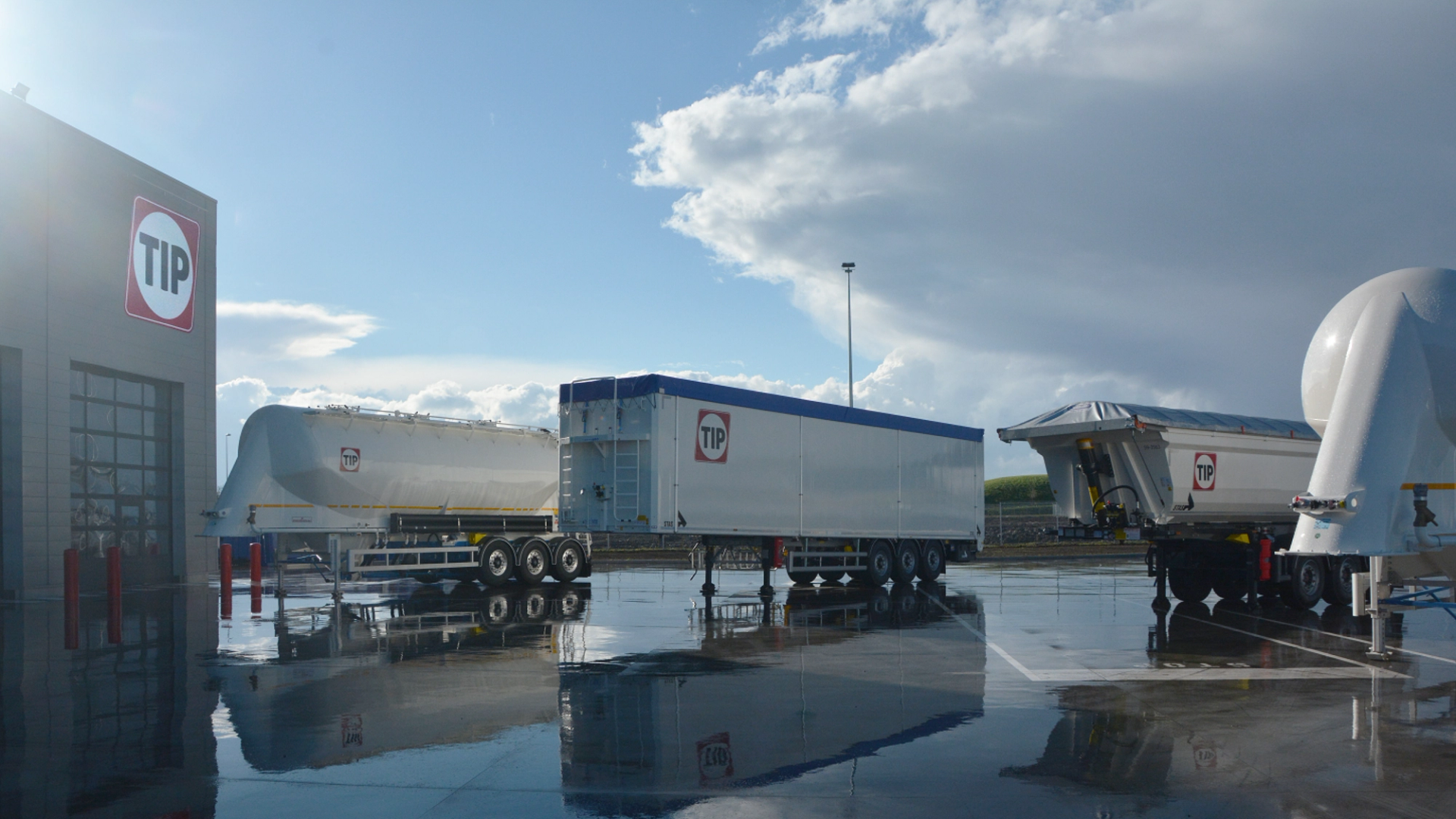
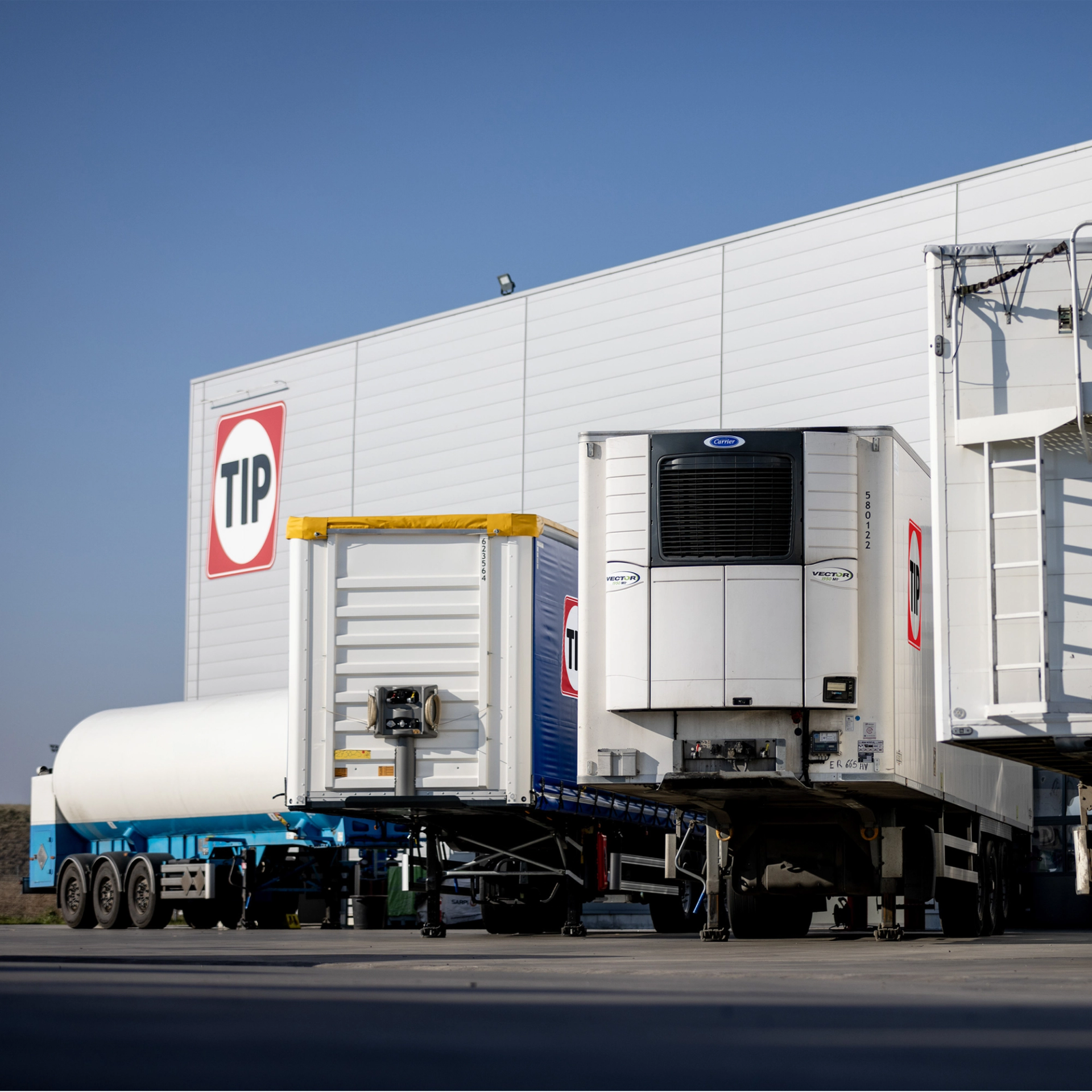
The visual identity was refreshed to match. Rather than a reinvention, it's a tightening: a more versatile colour system, a typeface with personality and precision, and a brand shape derived from the logo itself, tilted forward, grounded but in motion. The result is a brand that feels contemporary without feeling unfamiliar, and coherent enough to travel consistently across every touchpoint, channel, and market TIP operates in.
55 years of trust, reframed for what comes next
Tighter, more confident, and built for the long run, the refreshed identity positions TIP as a modern, expert, and forward-moving force in European fleet management, without letting go of the trust and reliability earned over 55 years. A brand that works as hard as the fleets it supports.