Challenge
Great infrastructure is invisible — until the brand makes it visible
Email infrastructure is one of those categories where the product speaks loudly to the people who build with it, and says almost nothing to everyone else. For Halon, that wasn't a problem — until it was.
After 15 years in business, Halon had built something genuinely exceptional: a scriptable, developer-friendly MTA trusted by some of the world's most demanding email operations. The product had depth, flexibility, and a loyal following among the engineers who knew it. But the brand didn't reflect any of that. In a space where most players lean into the same "mission-critical enterprise software" visual language — cold, corporate, interchangeable — Halon looked like everyone else.
The opportunity was hiding in plain sight. Behind the code, there was a company with a distinct personality: deeply technical, developer-first, and refreshingly human in how they work with clients. The brand just hadn't caught up.
What we did
Identity, messaging, and website — built for developers
The engagement covered the full scope: brand strategy, visual identity, messaging, and a new website. The strategic foundation came first — and it reframed everything.
Where most MTA vendors position around reliability and enterprise scale, we positioned Halon around the developers themselves. The people who choose the infrastructure, configure it, and build on top of it. That audience responds to honesty, technical credibility, and personality — not corporate polish.
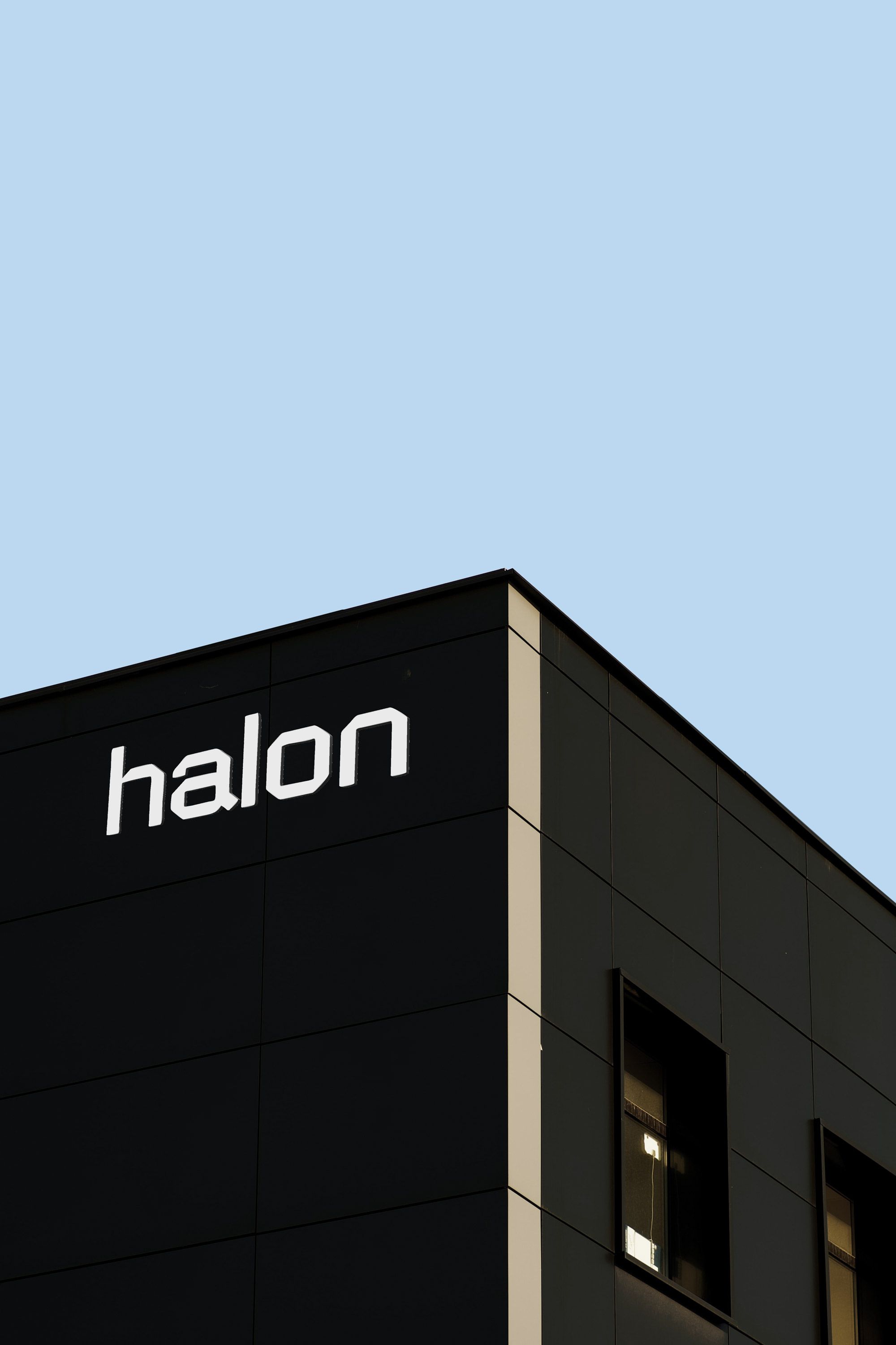
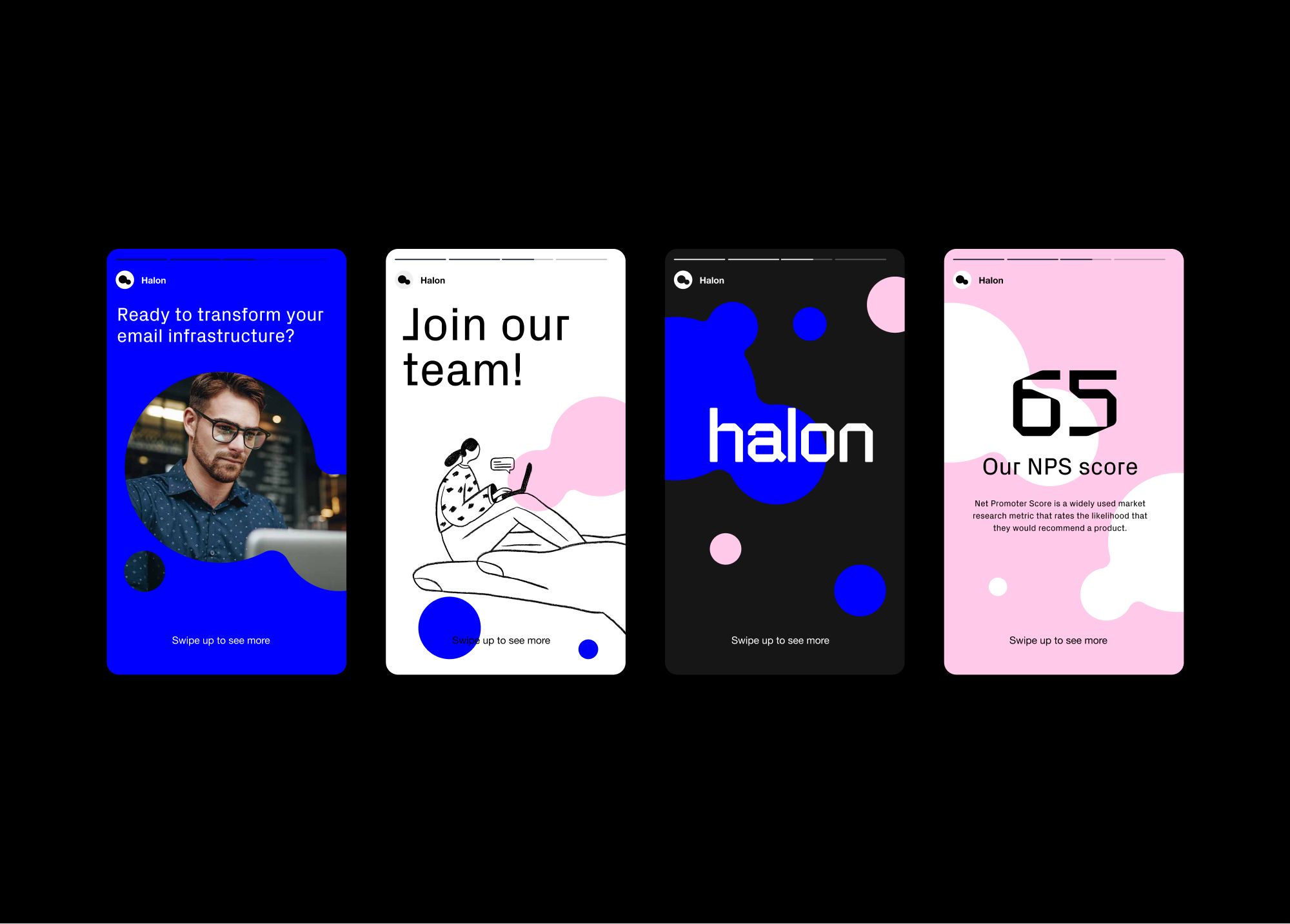
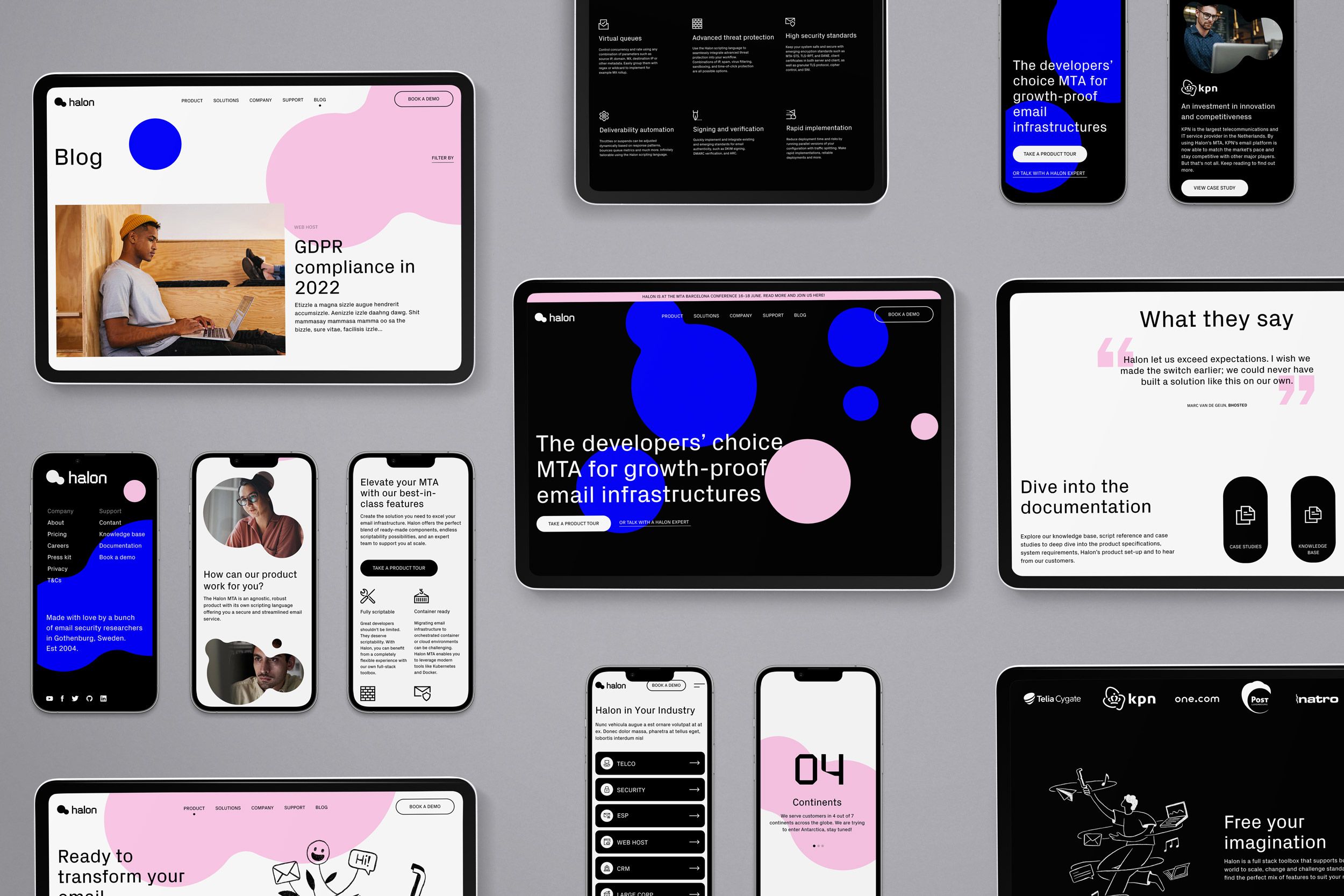
The new visual identity centers on the Halon molecule — a symbol that represents Halon's way of working: connecting to new systems, ideas, and people to create something greater than the sum of its parts. Bold and technical in color and form, but humanized through candid photography of real developer environments and a set of hand-drawn illustrations that nod to the creative, iterative nature of engineering work.
The messaging was sharpened around a single idea: growth-proof infrastructure. Not just powerful today, but built to evolve with whatever comes next.
The website brought it all together — structured for the developer audience, clear about the product's depth, and confident enough in its own identity to stand apart from every other player in the space.
“This is a major milestone for Halon. The new strategy provides us with a unique opportunity to become synonymous with modern, developer-friendly and forward-looking email infrastructure.”
— Anders Berggren, Co-Founder & CPO, Halon
Result
A brand that made 15 years of expertise finally visible
The rebrand didn't just sharpen how Halon looked — it changed how they were found. A 33% increase in leads following the relaunch validated what the strategy set out to do: make 15 years of deep technical expertise legible to the developers who matter most.