Challenge
Market leader. Category-defining product. Brand that hadn't kept pace.
Quinyx had built something genuinely transformative. What started as a solution to a McDonald's shift manager's frustration with manual scheduling had grown into the platform of choice for some of the world's most complex workforce operations. The product worked. The customers were loyal. The growth was real.
But the brand told a more cautious story. In a category defined by enterprise software aesthetics — dense, corporate, and almost deliberately joyless — Quinyx had an opportunity that most of its competitors had ignored entirely. Workforce management is ultimately about people: the managers trying to do right by their teams, and the frontline workers whose experience at work shapes their entire lives. A brand built around that human truth would stand apart from everything else in the market.
The brief was to build a brand strategy and identity that reflected Quinyx's actual position — market leader, innovator, genuine believer in the relationship between happy employees and successful businesses — and gave them a platform to grow from.

What we did
Brand strategy and visual identity — built around happiness and simplicity
The engagement covered brand strategy and full visual identity. The strategic work came first and set the direction for everything that followed.
The brand platform we developed centered on a simple but powerful idea: happy workforce, happy business. Not as a slogan, but as a genuine operating belief. Quinyx exists to make work better for the people doing it — and the business case for that is overwhelming. The brand had to embody that conviction, not just describe it.
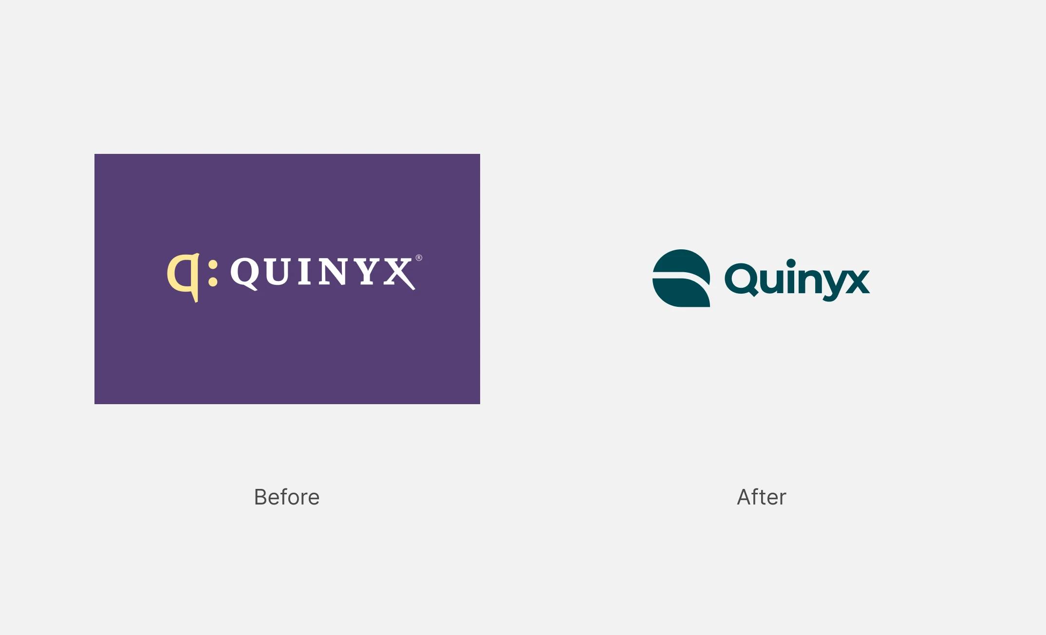
The visual identity was built to express happiness and simplicity at every touchpoint. The new logo evokes the vernal equinox — a moment of balance and renewal — and reflects the nature of workforce management itself: moving pieces coming together seamlessly, organisations finding their flow.
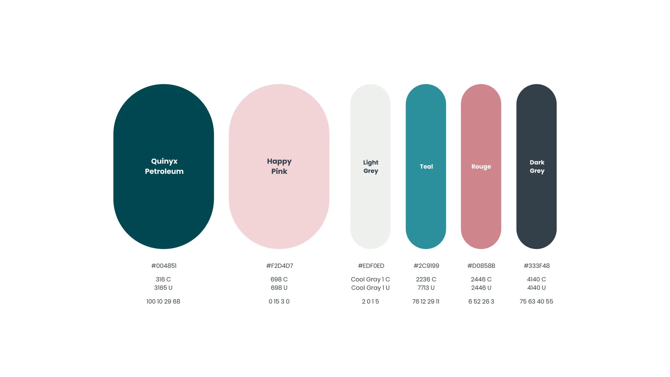
The color strategy was equally deliberate. Pink carries the happy — youthful, energetic, and distinctly human in a category dominated by blues and greys. Petroleum green carries the business — clear, professional, and direct. Together they create a palette that feels simultaneously joyful and credible: a brand that takes its work seriously without taking itself too seriously.
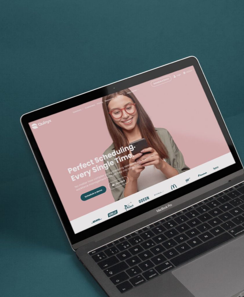
Photography direction, typography, and tone of voice were all calibrated to reinforce the same values. Candid, upbeat, honest — the visual language of a company that genuinely believes in what it's building.


Result
A market leader that finally looks like one
Quinyx now has a brand that reflects the company it has become: confident, human, and distinct in a category that rarely manages to be either. The identity gives their sales and marketing teams a platform that works as hard as the product — and signals to the 800+ organisations that trust Quinyx daily that they made the right choice.