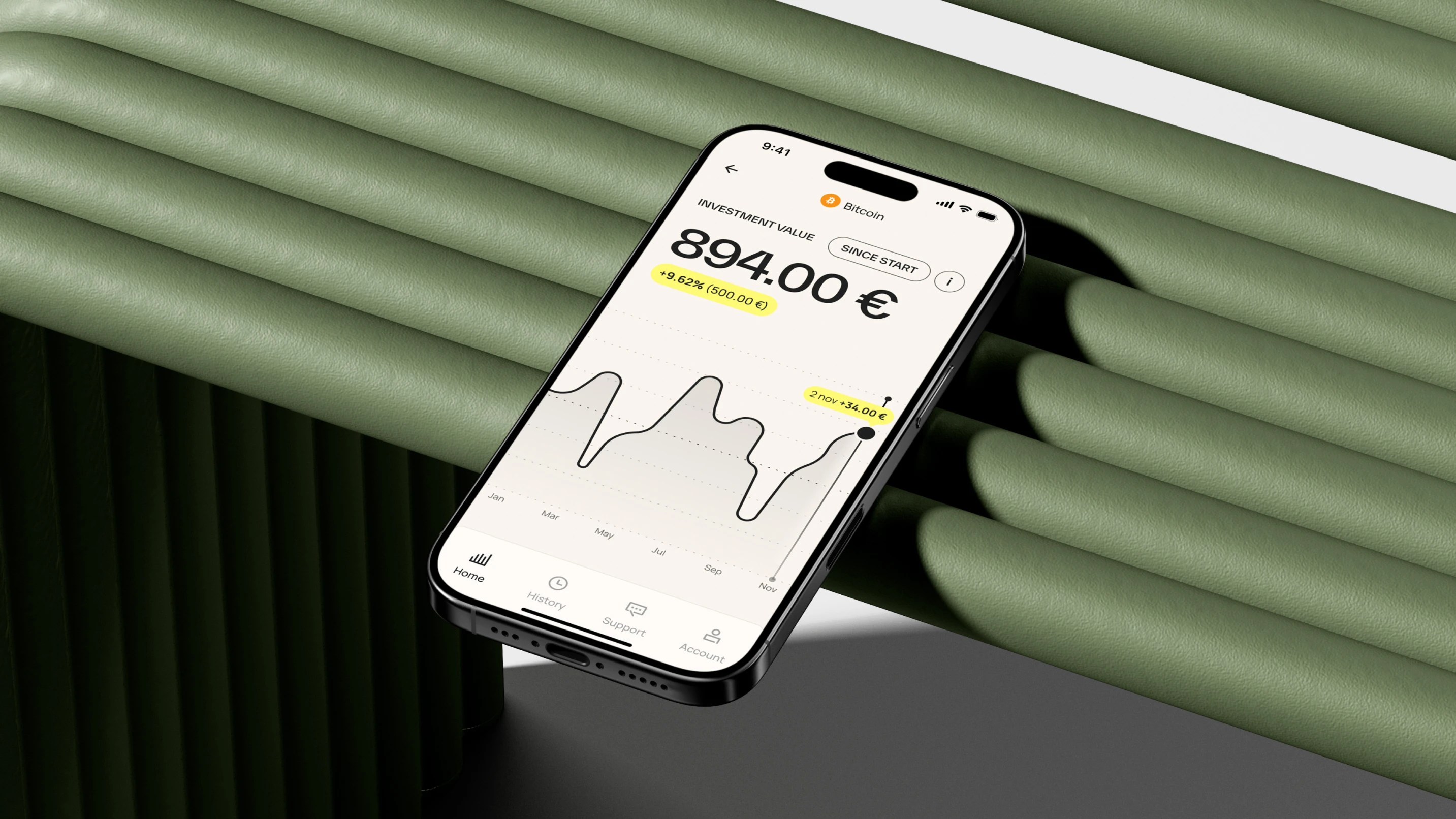
Digital products for web and apps, designed to earn preference
Great product design is not just about making things look good, it is about making them work. We design interfaces rooted in user behaviour and business logic, validated through testing before you commit to building.

Oskar Pettersson Hedin
Design director
What sets us apart
Human-centered by default. Every product is built for real people, not just use cases. We design for behavior, emotion, and long-term engagement, whether the product is B2B or B2C.
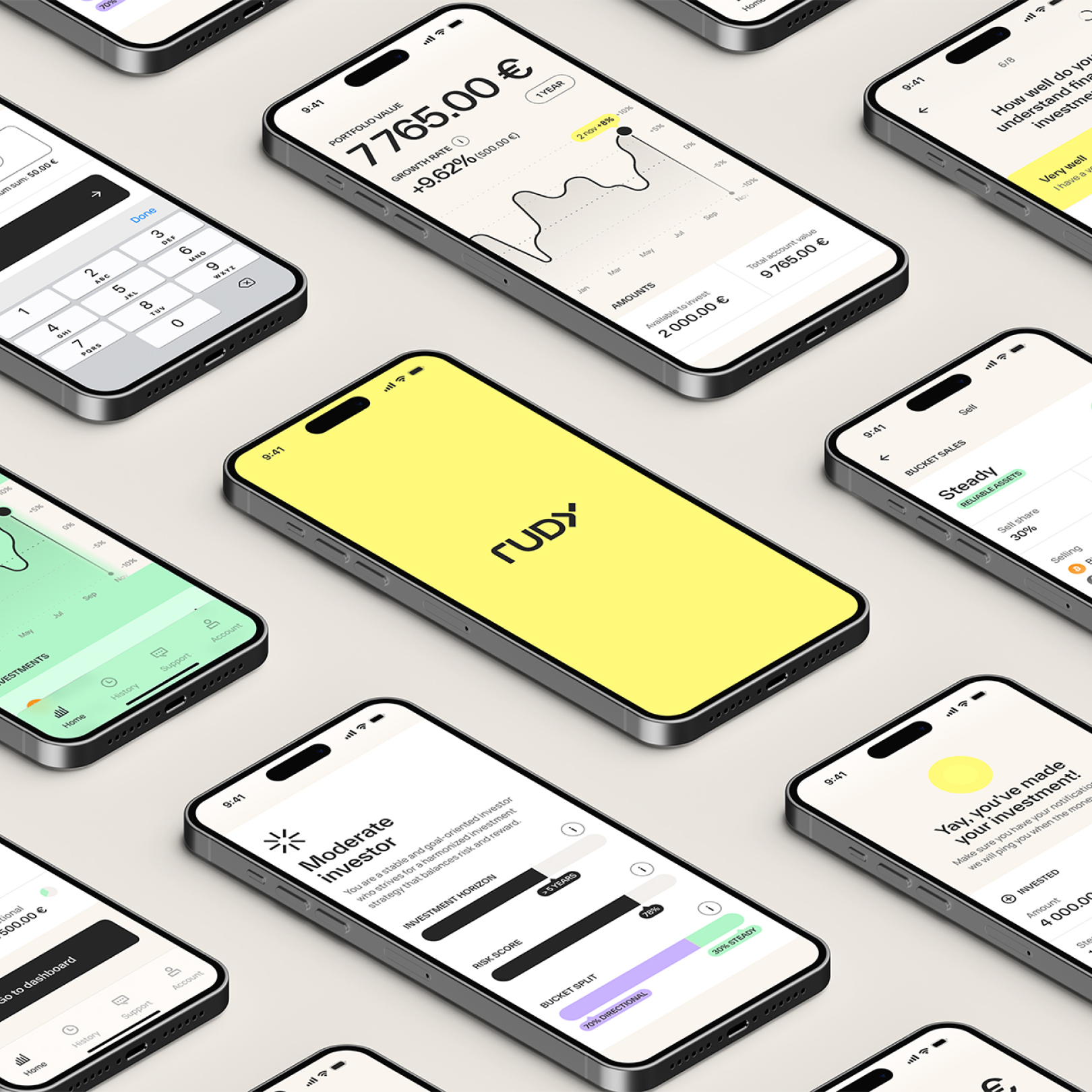
Strategy before screens. We never start with pixels. Positioning, user needs, business goals, and technical constraints are aligned before design begins.
Design precision at every level. Craft is not an afterthought. Micro-interactions, motion, accessibility, performance, and visual hierarchy are treated as critical product features.
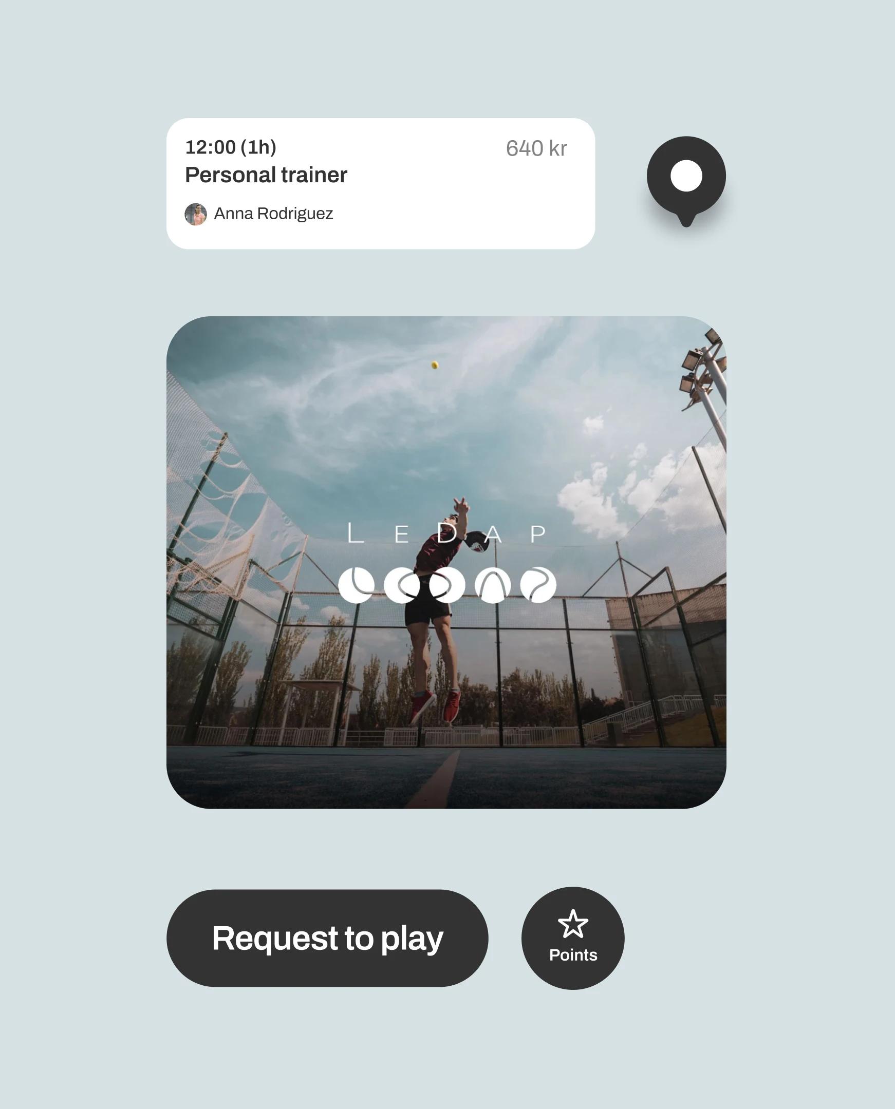
Rapid validation through prototyping. We turn ideas into testable prototypes fast, reducing risk and accelerating decision-making through real user feedback.
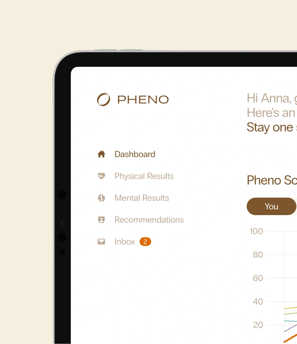
Continuous testing, not assumptions. We validate decisions through real user testing, usability studies, and iteration. Insights from testing directly shape flows, features, and interactions throughout the process.
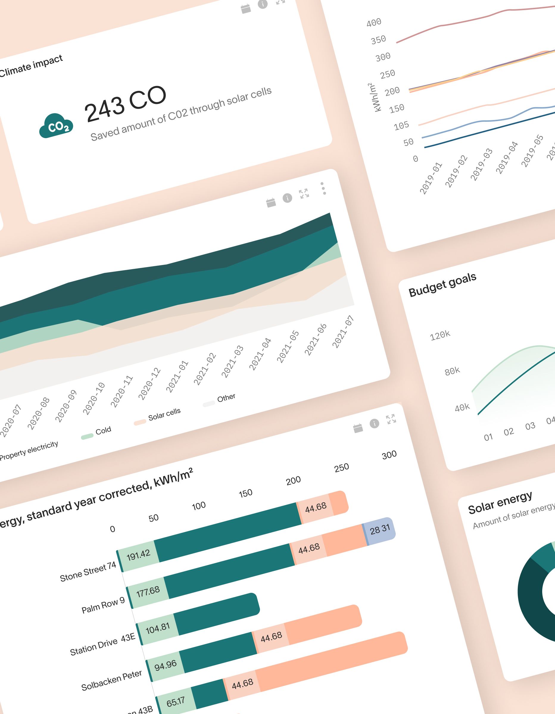
Built to scale with product teams. Our process is designed to integrate with in-house product, tech, and growth teams for long-term product evolution.
Award-winning work
From crafting unique brand identities to designing intuitive websites and valuable content, we're here to execute your ideas. Contact us, and let's discuss your project.

Tor Nettelbladt
CEO