Roots that had lost their form
Before the internet, Lohmann and Mini spent around 20 years working with Italian masters such as Renzo Piano, Andrea Branzi, Bruno Munari and Achille Castiglioni. That attitude has always lived in designboom’s content, but over the years its visual expression had faded.
The new identity had to:
- give that attitude a visual form
- stay calm and legible for daily publishing
- scale from web to social, events and activations
Our idea: Back to the radical start
Instead of looking forward, Most Studios went back to where designboom began. Italian Radical Design of the late 60s and 70s, from Superstudio and Archizoom to Sottsass, Alchimia and Memphis, treated design as argument, not service.
The identity doesn’t copy the look of the 70s. It applies the same thinking to a modern digital brand, holding structure and disruption, restraint and excess, at the same time.
“Radical Design treated every object as an argument. We took that into the digital era: a system with a calm core and room for noise, where the rules are there to be bent on purpose.”
— Oskar Pettersson Hedin, Design Director
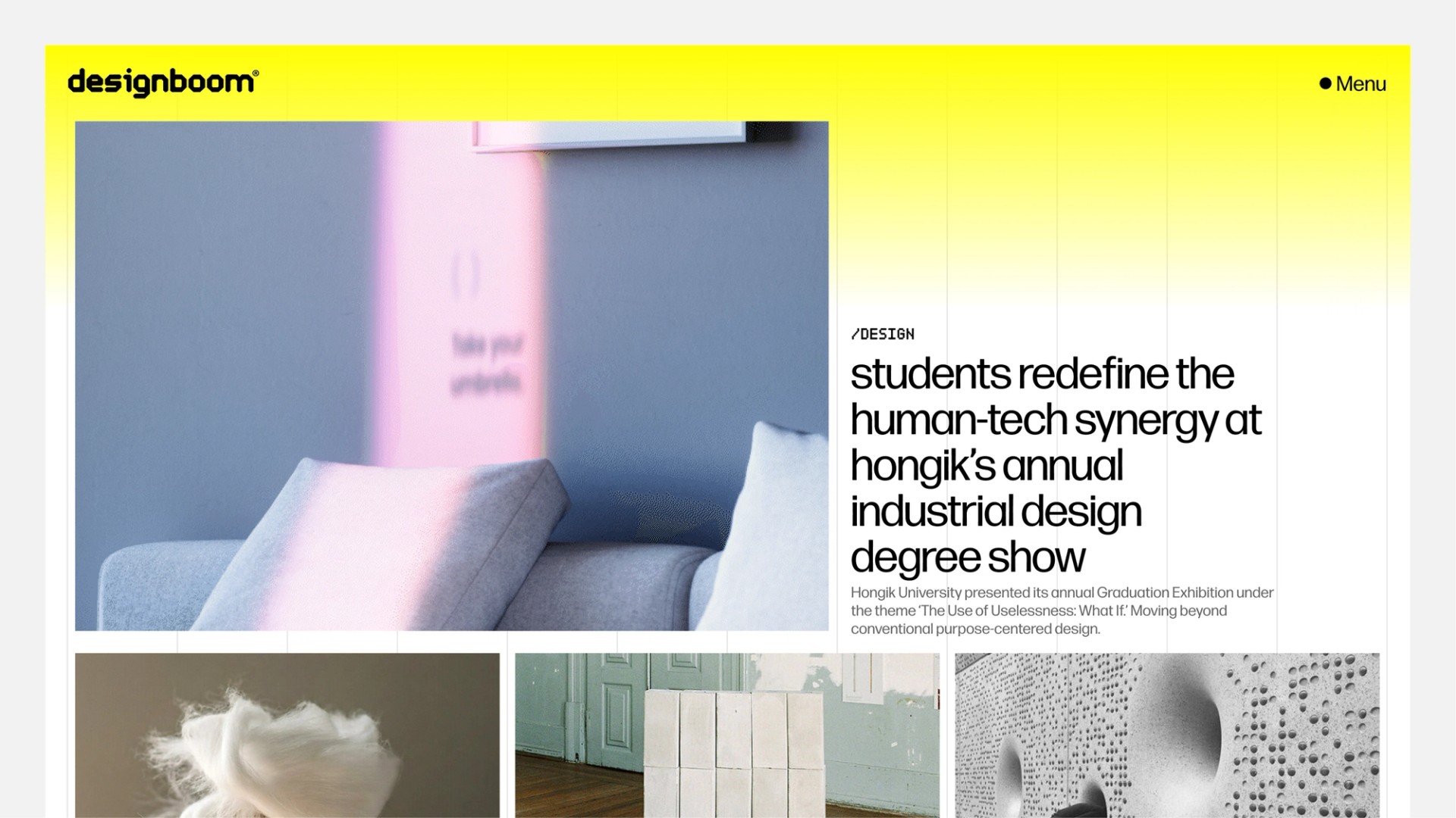
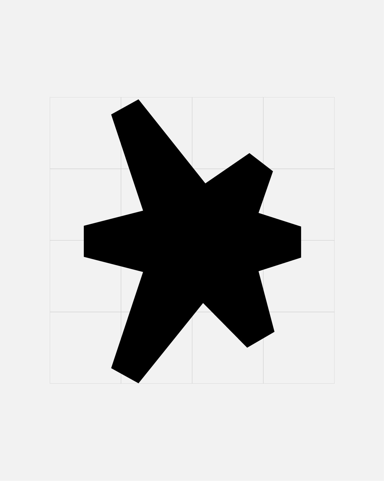
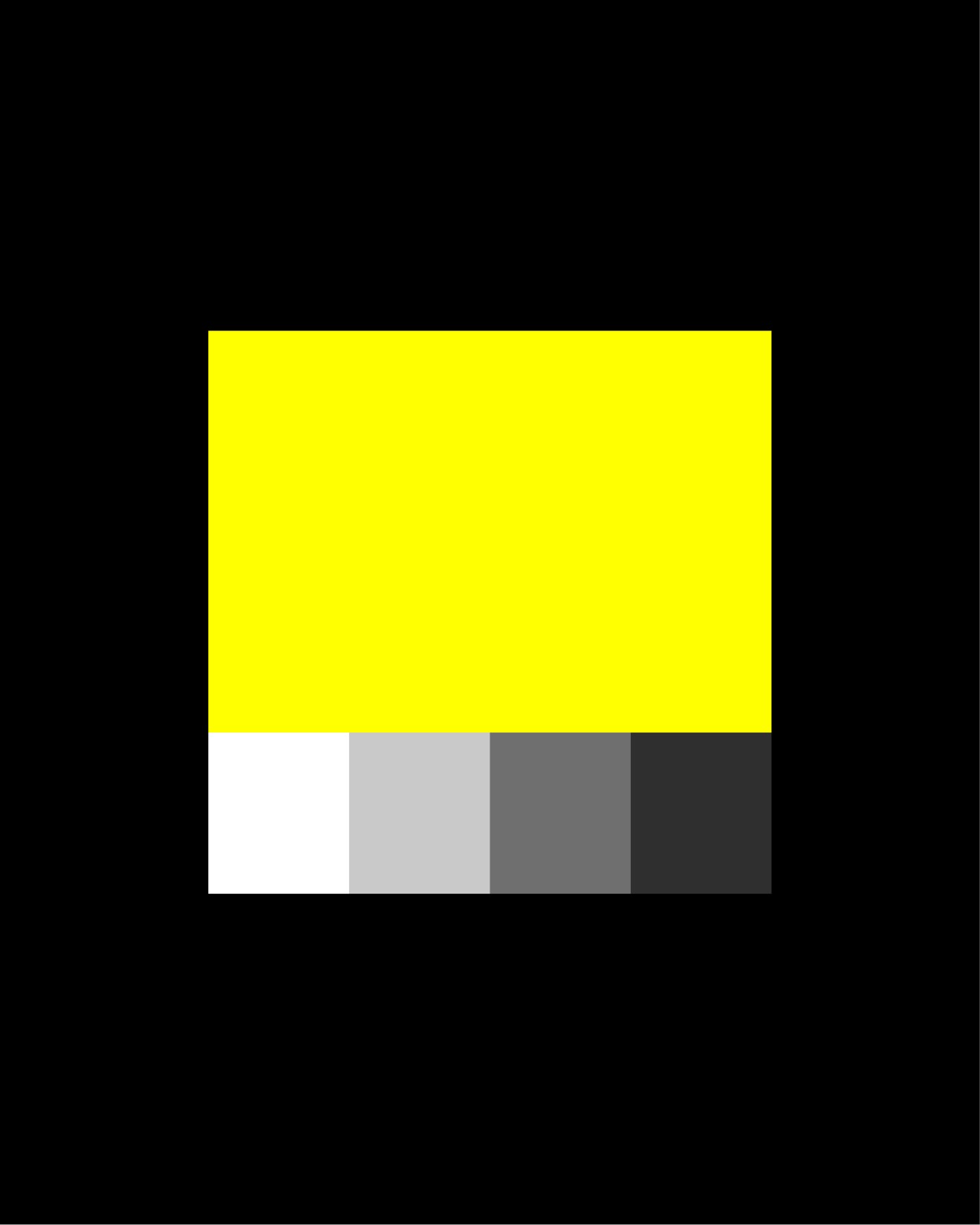
A system built on structure and friction
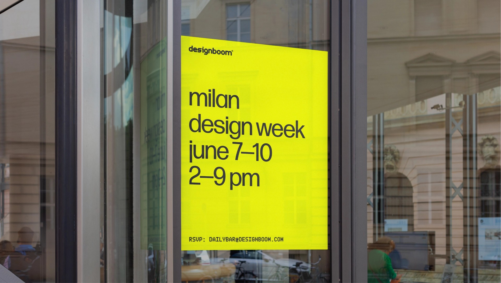
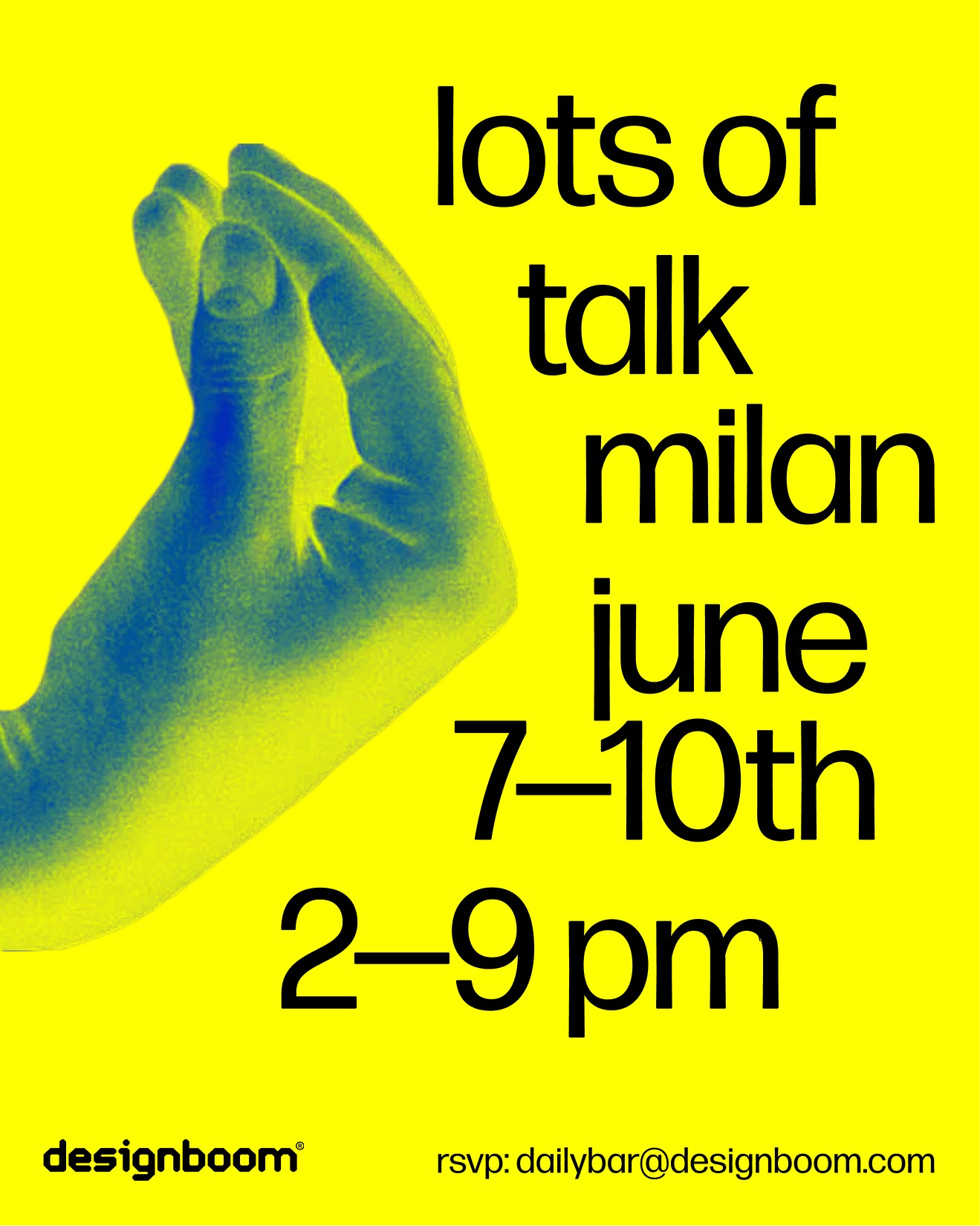
The logotype stays fixed, so everything around it can move. Pure digital yellow works both as a signal and as space, like the warning signs and temporary structures it borrows from.
Forma DJR, an Italian typeface from 1968, holds the structure. The dot-matrix OO Therean breaks it. Lowercase by default keeps the voice closer to conversation.
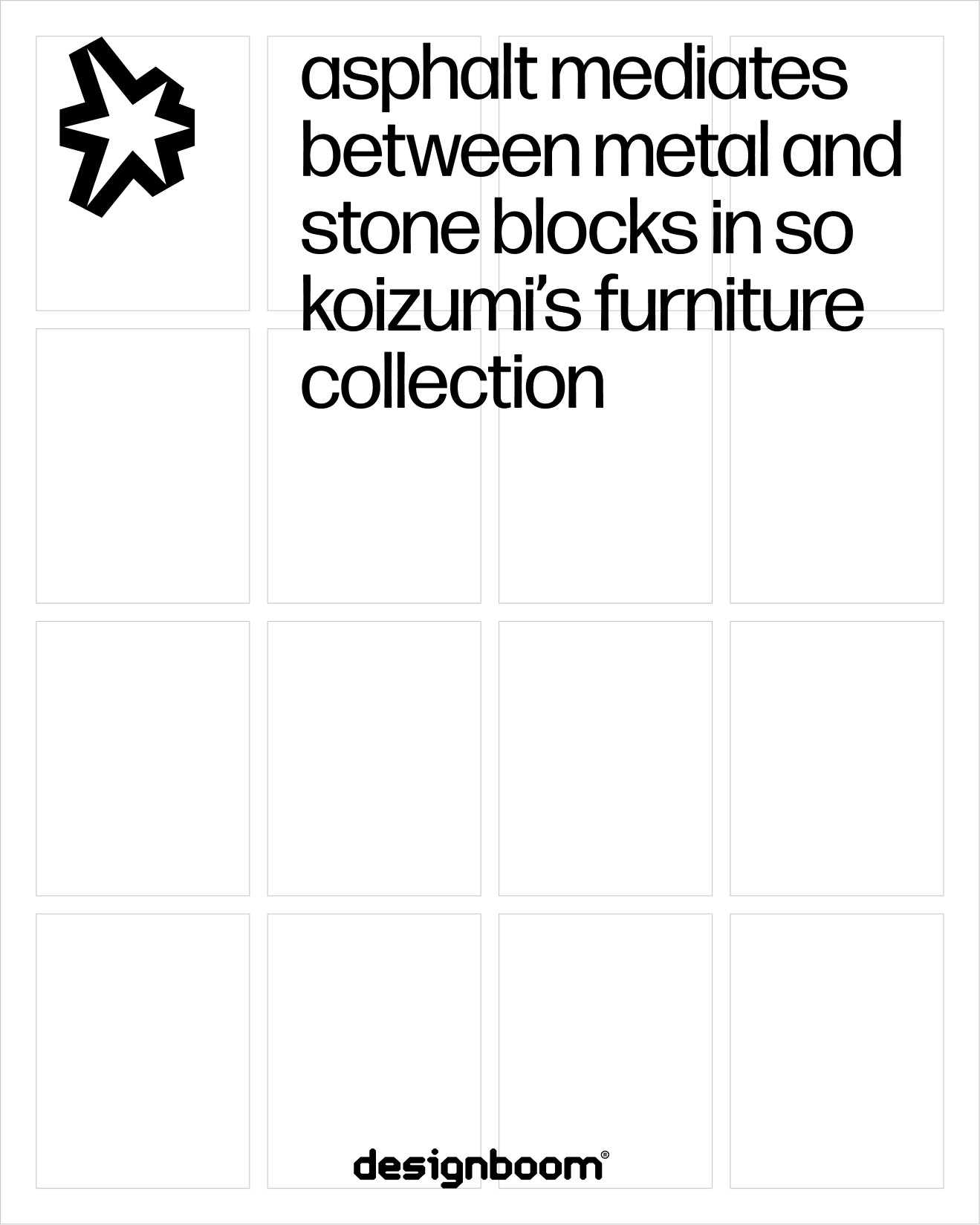
One DNA at three volumes
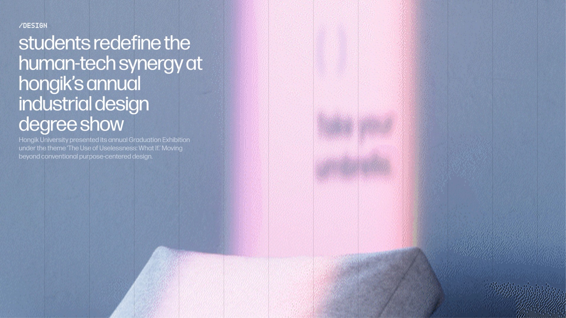
Core keeps web and stationery restrained and legible. Mid brings type play and accent colors to social media and communication. Max turns events and activations into bold collage and motion-led compositions.
The result is a living publishing system that holds archive and speculation at once, without imitating the 70s.